Showing posts with label art therapy. Show all posts

Saturday, January 18, 2025

Mather Art: Audacity and a Good Story to Tell


STILL an Ad-Free Blog

Hi, I don't know about anyone else, but January is zooming by as quickly as December. We have had doctor appointments, and lots of trips to a friend's home who passed away and my hubby is executor and well, that is another can full of messy worms. 

Onward, between cleaning and schlepping back and forth between three houses(long story) I did have my Mather class to fall back on for sanity.


Sadly, the Watercolor class is not on right now, but my 
Creative Mindfulness class has been so much fun and a peaceful as well as exciting start to the New Year.
Zentangles have been a theme for the month. It is surprising how relaxing drawing repetitive lines can be.


oldnewgreenredo

In my BIO I refer to myself as an artist. I did make my living as a stoneware and porcelain potter. I started out in Drawing and painting, but once I stuck my hands in clay in my sophomore college year, I never looked back.

Clay was resurrected again after my first child, I had a studio above our garage, gave classes to pay for my equipment and started doing art/craft shows and galleries. I also invested my stock in consignment shops, which was a great way to get a following and some great sales.
oldnewgreenredo

I still sketched or painted occasionally, mostly designs for pottery, layouts of displays, and an occasional card or poster for some event. But my skills deteriorated over the years from the lack any serious production in the 
2-dimensional arts.

That doesn't mean I didn't have art supply arsenal over the years. My son raided my supplies when he went to college for art. But as the need arose, I added good quality supplies to my bins when I found them thrifted or super sales.

When I started doing the Mather classes(drawing first) I really only needed erasers, I had enough papers and sketchbooks to keep me occupied and a bevy of pencils/pens.

The drawing tools above are what I have been using for the Creative Mindfulness classes. I added a metal square (12x8) to make my original square---square. For the life of me, I have never been able to draw straight lines.

I used a mildly textured Cardstock 12x12 in white...this is excellent thickness for the strong markers, and I got clean lines with a single stroke.

Below is the class prompt courtesy of Mather.com


The above is the prompt for the first week of January's class from Mather. The source of the prompt is in the turquoise print.

I'm not great at following directions, so when I got to the fourth set of lines I screwed up...since we were working in pen...that was it, I had to commit or start over, so I kept going as the class moves swiftly.

oldnewgreenredo
The thing that makes the class interesting is all the participants interpret the prompts differently. I followed the rest of the directions and chose to emphasize my swirls with curving lines instead of following the suggested pattern of straight and slightly curving lines. I used dots to give the idea of distance--like stars in the sky.
oldnewgreenredo

I did focus on the lines from square 2 in the prompt, as well as the black/ball intersections. This gives your eye somewhere to focus on...because these patterns can be quite mesmerizing. Even though none of my lines are exactly curved, round or even...it is an interesting pattern. Butterflies/beachballs and weather patterns, lol.

NEXT Project

The second week in January this was our NEW prompt, again from Mather and the source is pattern collections.com, the artis YuRu Chen


This is called U or V line..

With the added details...and suggestions to take it any way you wanted to...this was so interesting. I was excited to use some color. (Seriously, I need to get a 10-pack of Black Sharpies, though) LOL

oldbnewgreenredo
My work area is perfect, I hang the prompts on the blinds and have the computer for class to the right or left in my 'studio/office/extra bedroom'. How many of us have one of those or wish we had?

oldnewgreenredo
I've shown these before---yes, $5.00 from 5 Below...I really love these markers and ordered a set for the Grand for Christmas and an extra set for me...they blend and are strong colors, dual-tipped, and I also ordered a smaller set in neutral tones. I'm going to try some portraits later.
oldnewgreenredo
In my design interpretation, I added an extra band, and also tried to add depth by going from narrow to larger on the left one. I wish I had overlapped the crossing bar over the left bar going from left to up. Anyway, this is something you can take many different directions.
oldnewgreenredo
Class moves so quickly...roughly 35-40 min for drawing that you don't have time to take photos of the work in progress. When life settles down here, I will try a few more photos of a similar project in progress. 

oldnewgreenredo
By the time I had all the black lines in...and anticipated adding color. I consciously chose a title and a theme...'Nefertari's Jewels'. 

The Natural History Museum here in Chicago was always my favorite and I visited many of the special exhibits over the years on Egyptian art and history. 
King Tut being the most famous. The beadwork and inlaid semi-precious stonework on metals was amazing, as were the pottery vessels and statues. 

Working from my own memory impressions, I colored the green fronds in first, the sun-crown(scepter) of course needed to be warm colors. Wanting to limit the palette I chose red-orange, golden yellow, yellow, green and a blue. Staying consistent within the designs of the black lines, I filled everything in, but left the white in the bands or straps bare. 

Thinking of the V motifs as papyrus I added little fronds at the top of each, which really took this to Egypt.

oldnewgreenredo
After filling in selected backgrounds with black and orange, my design ended up being very striking. 

Total working time roughly and 1-1/2 hours from start to finish including the class time.

Fun stuff, if you are 55 or over...Mather classes are free and excellent for everyone. Illinois residents are eligible for free supplies in some introductory classes. Just google Mather Creativity Classes or Mather Programs.
oldnewgreenredo
Yep, this is me, and this recommendation is from the heart. I have no Monetary/or Affiliation connection to Mather. The staff is highly educated and many certified Art Therapists and others very helpful. The community of 55 and older students varies and is very interesting. We share our questions and successes, even some failures in the spirit of one learns from ones' mistakes. Mather has many great programs in the following areas: art, travel, health, exercise, the mind, crafts and more. Take a peek. 


After a year of crazy health issues, surgery, I love this quote for moving forward into a healthier New Year...
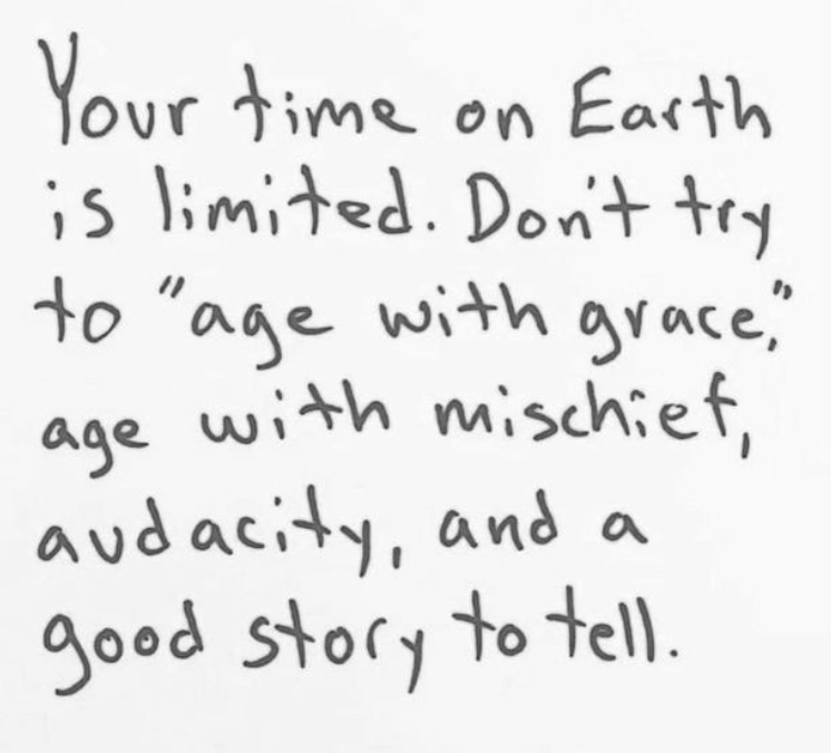
lifted from pinterest...author unknown

AND HUGS to you who are 
NEVER TOO OLD
 TO LEARN NEW THINGS!

If you enjoyed this post(s), please join me by email- at 
FOLLOW IT---upper right hand corner.

I have not been paid or reimbursed in anyway for my opinions or products shown, or from where I shop. 

Friday, August 2, 2019

#WorldWaterColorMonth! Day 30 Wild Things: Learning to Fish

Ad-Free Blog

Day 30---ONE MORE TO GO...

I splurged yesterday and bought an 18x24 Canson Water Color Pad 140# Cold Press paper,
 at 40% off. Art online stores charge for shipping unless over $50.00, so this ended up being 50 huge sheets for $23.40. Besides I got to touch it...and liked the feel and thickness of the paper.

This is still student grade---but reasonable enough I can let the Grand paint on a Big scale too. 

My challenge today was to paint Wild Things, I had just done a frog---from our pond. Then I thought of the Raccoon, that dragged clams up from the lake---(2 blocks away) to wash them in our pond, after cracking them on our rocks. Also probably the same raccoon that stole all the goldfish we put in the pond one year. 

Then I thought of my son's cats who were feral kittens and are still wild at ages 14. They are big orange and white tabby now--one striped and one patched, so this is imagined
 Leo, "Learning to Fish".


First, working on a big space on good paper is very freeing. 
Layers and layers of color washes built this up. And it quickly dried enough to take as many layers as I could put on.  Learning when to stop---I think that is the biggest lesson of this painting.


Second, I chose a huge 1 1/4" Mop brush and an old squirrel bamboo brush. The bamboo is a 1/4" brush. Both were originally purchased for ceramic under glaze and glazes. The mop is at least 30 years old, the label is gone, but it must be a synthetic to hold up to glazes. The bamboo brushes I would use up in 6 months because glazes are really grainy and damaging. 

The Mop carries a ton of water, but also makes wonderful shapes when you twist and turned it, All of the goldfish was painted with the mop---except for the eye detail. I was having too much fun to take a series of photos. 


The fish is one of those ugly koi--not the carp ones, but the one with bulgy eyes and lumpy bodies. We don't have koi in the pond, no sense feeding the raccoons.

The paper was very absorbent, held it's shape, I used the smoother side which was still a bit textured. I'm anxious to try the rougher side tomorrow. 


I would have like to work more on the eyes...but I know you can really screw up a painting or a drawing...going in for the one last bit. 

I had filled up my palette with some new colors by Grumbacher Academy and
 Winsor Newton.

Palette: Lemon Yellow, Cadmium Yellow Deep, Cadmium Yellow Pale, Yellow Ochre,Alizarian Crimson, Winsor Red, Sap Green, Hookers Green, Cerulean Green, Manganese Green, Prussian Blue, Cobalt Blue, Thalo Purple, VanDyke Brown, Burnt Sienna, Lamp Black. 

The palette looks like I used everything. Well, did Leo catch a fish...of course not---!
Hope you are enjoying summer! 

Please visit Doodlewash  
if you are interested in starting to watercolor. There are lots of talented and beginners there, and the community and shared information is wonderful. There are continuing challenges to get a newbie or pro to paint!

I'm not advertising, I just think this is a worthy cause:
Please don't forget Dreaming Zebra Foundation
 the above supports art materials for children...
take a peek.

Disclaimer: Any products I am using are not a recommendation, but only for reference for the reader's use. I am in no way affiliated with any of the companies or products, or have I received compensation or products. 

My painting projects will be posted on Pinterest, Flickr and Facebook with the hashtag 


Thursday, August 1, 2019

#WorldWatercolorMonth! Days Days 26-29

AD-Free Blog

Wow, sometimes life gets in the way. Between catching up in the garden, therapy, listing many new items on Etsy(research), driving, and trying to resume some real life--last week got away from me. 

We have some beautiful weather now in Chicagoland, so I moved off the kitchen table out onto the porch to paint with windows surrounding me. This is really ideal, no direct sunlight except early in the morning and lots of room to spread out. I'm sticking with the suggested prompts. I need some sort of discipline, because I have none of my own, LOL. 


ONLY TWO MORE, after this.


Day 26 Natural Wonders. 
Between the woodchuck under the kitchen porch, the possum under the deck, the gazillions of birds (we feed them), the hippies, squirrels, we have a small pond and frogs. So we have 'Natural Wonders' everywhere. Our frog this year is tiny--but we never know when a big one may show up, we have had large fat happy frogs in the past. I worked this pretty wet, spritzing water in various areas and letting the paints spread.

Palette: VanDyke Brown, Cerulean Blue, Prussian Blue, Prussian Green, Lemon Yellow, Cadmium Yellow Pale, Thalo Purple, Cobalt blue,Lamp Black


Day 27  Fruits, 
I worked this very wet---you can see the paper has buckled. In a way it helped with the translucence of the glass but I lost the plate/bowl. I wish I had just done the glass, but the watermelon piece and rind looks nice and juicy. 

Palette: Prussian Green, Yellow Green, Lemon Yellow, Cadmium Yellow pale, Lamp black, Prussian Blue, Cobalt, Alizarian Crimson, Winsor Red,


Day 28 Mettalic

This was fun---it's a galvanized metal drink dispenser, we only use it for Water when we have a big group. Late in the day and with two light sources on it, there were tons of reflections and variations on the surface. The shadows kept changing, so my colors did too. I tried to work loose and not overwork anything.

Palette: VanDyke Brown, Thalo Purple, Prussian Blue, Burnt Sienna, Lamp Black, Cadmium yellow Pale.


Day 29 Glorious Green

Our whole yard is green, this is the back corner of our garden where the squash plants are going crazy, climbing up the fence. Sometimes they make it to the roof of the neighbors shed and make their fruit up there. It's very late for the garden this year, we hope we get some ripe squash, they are great keepers and we usually have squash until spring  in the cabinet designed for potatoes,onions, etc. This was worked very wet with built up washes and lots of over painting.

Palette: VanDyke brown, Prussian Green, Hooker Green, Lemon Yellow, Cadmium Yellow Pale, Prussian Blue, Lamp Black

I'm planning on posting one painting experience a week, when this ends. Please visit Doodlewash  
if you are interested in starting to watercolor. There are lots of talented and beginners there, and the community and shared information is wonderful. There are continuing challenges to get a newbie or pro to paint!

Please don't forget Dreaming Zebra Foundation
 the above supports art materials for children...
take a peek.

Disclaimer: Any products I am using are not a recommendation, but only for reference for the reader's use. I am in no way affiliated with any of the companies or products, or have I received compensation or products. 

My painting projects will be posted on Pinterest, Flickr and Facebook with the hashtag 


Thursday, July 25, 2019

#WorldWatercolorMonth! Day 25 Shades of Pink

Ad-Free Blog

So, Today's theme is Shades of Pink, which of course made me drag out one of my dolls. Since I didn't have a computer---I thought painting from a doll was better than making it up...


I worked on sketchbook paper---because I haven't done any watercolor portraits, and I look at my watercolors as a 
LEARNING EXPERIENCE!


You can't grow, unless you give yourself permission to learn!

I hope you can see my faint sketch---I wanted the subject to look like a real person, 
so I thickened her arms and neck, Barbie tends to be 8 foot tall and skinny!


She is one of my vintage (OLD) favorites. 
Her gown is white, but I figured I could go pink without any big issues.

Palette: 
Thalo Purple
Prussian Blue
VanDyke Brown
Burnt Sienna
Lemon Yellow
Winsor Red
Alizarian Crimson

I worked mostly with synthetic 1/4", 5/8", 3/4" flats  and a very small round at the end for detail. Most of my brushes are so old, I can't see the brand names on them. Basically I use good quality synthetics originally designed for acrylics and craft painting. I like a brush that doesn't go limp, so the stiffer acrylic brushes are fine.


I did the background (Prussian Blue, VanDyke Brown and a touch of crimson) lightly first ---I tried to use Alizarian crimson in all my color mixtures---to go with the shades theme. At this point, I knew the white hair wasn't going to look real,
so I planned on blonde. 


This is basically after the first layers of color. And here is where my memories started to take over. 
I was 15 again, at my first formal---awkward, ( I was never a girly girl) so dressing up was a challenge.) I loved clothes, but more from a design point, rather than wearing them.


This dress is far more sumptuous than anything I ever had...I tried to do the lace on the bodice. Then, the face became an issue---she wasn't happy---probably because of feeling awkward. 
This photo was of wet paint.

I later added some yellow/pink in the dress to go with the hair. Thalo purple, VanDyke Brown, and the Alizarion Crimson were mixed for the darker shadows. 


I finally had to walk away---wait until the saturated and muddy paper dried. Sketchbook paper does have an end point!  I eventually dry-brushed in some of the details
 and then walked away.

IF I do a portrait again---I will use some fabulous paper---that I can rework, when I get into trouble. 
I did manage to rework her mouth. 
I still love the memories represented here: the rustle of the fabrics, the heavy colognes everyone wore, the sticky hair, the heat of the room mixed with teen angst---all rolled up into one portrait. 

Do you remember your first formal event? 

Disclaimer: Any products I am using are not a recommendation, but only for reference for the reader's use. I am in no way affiliated with any of the companies or products, or have I received compensation or products. 

My painting projects will be posted on Pinterest, Flickr and Facebook with the hashtag 


Don't forget the above supports art materials for children...
take a peek.