Showing posts with label Palette. Show all posts

Wednesday, March 12, 2025

Mather Abstract Watercolor Class: Painting With Music

Ad-Free Blog

Last week's class was very inspiring in my FREE Mather Abstract watercolor class for Seniors.

Mather Classes for Seniors can be explored HERE.

Ruth showed us several paintings by different artists. Many artists worked to music, Kandinsky, Chagall, etc.

Ruth played samples of instrumental music, this and that for us to paint to. Here are my results. These are quick pieces done to music under 5 or so minutes.

oldnewgreenredo

My palette is a mess....I'm trying to use what is there so I can give it a good clean up and a fresh start.  

oldnewgreenredo

I'm finally doing all my paintings and exercises on REAL Water Color Paper. Strathmore 140# in various types of paper from a sampler pack.  I may buy a few more when the Buy 1 get 1 sale is on at my local craft store. Good paper just takes the paint, the water, and the 'working over' better than the multi-media paper I use from my notebooks.

I'm also more confident from all the techniques I have learned. So, I just simply let myself go with the music prompts

The music was extremely varied....

oldnewgreenredo

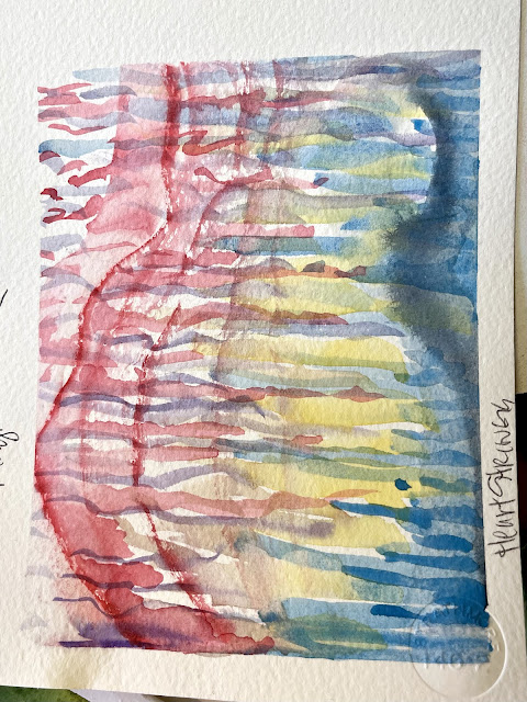
Magic Walk, I couldn't find a copy of the music...but it was rhythmic and a bit bee-bop...if that helps. Very bright and fun. Definitely some ethnic vibes, Caribbean, Soul, and Street sounds. I started with the dark yellow and worked outward.

oldnewgreenredo

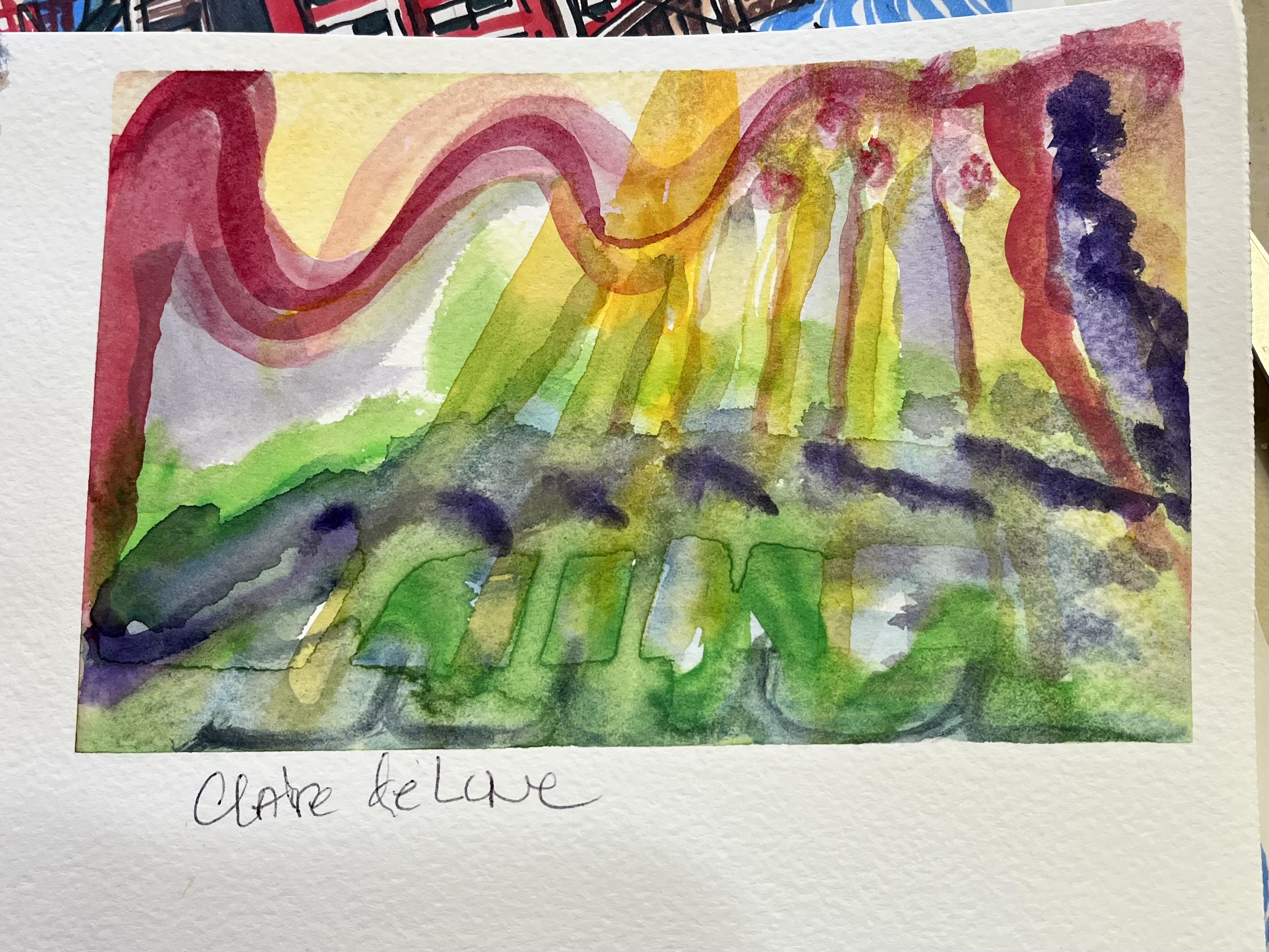
Clair de Lune.  I waited a bit before I started painting...when the orchestra really starts to swell and almost closing my eyes I started painting.
Below is link to YouTube Frankfurt Symphony Orchestra..
This is a very slow version. Lovely and elegant.

oldnewgreenredo

This piece was swoops of thick water tinted lines left to right to this music in the beginning...then each color was a theme section and carefully applied with the notes. Intentional yes, but strokes with the music's movement. Later in the piece when it repeated some element---I worked over the colors. 
 I think this is the piece..

oldnewgreenredo

Turned on its side. Most Music is repetitive or with variations upon a 'theme' or series of notes. The key may go higher or lower, the Color of Sounds or (colors changed when I painted during these), with the tempo of the notes also giving you inspiration (quick strokes closer together when they are speedy, wider when slower ). 

I really loved doing these.
I received a stack of classical CD's for Christmas and I think I may go through them and paint an abstract painting every week and see what I end up with. Besides this is totally relaxing and being lost in the process...

Phew!
Thanks to my Mather Senior classes Painting is such a respite in this world of chaos! 

Free Mather Classes for Seniors can be explored HERE.

How are Your Projects 
or Artwork Coming Along? 

Vintage Charm


All the opinions and photographs in this blog are my own, I have not been paid or reimbursed in anyway for my opinions, posts or any products shown. Please do not use photos without linking back to this blog without my permission. Thank you for your cooperation, Sandi Magle


Saturday, September 14, 2024

Playing with Paint: September #1

Ad-Free Blog

I've been PLAYING WITH PAINT on this in the mornings...very slowly, not my usual mode of operation. But, it's so relaxing and clears my mind. 


oldnewgreenredo

 Here is the stage I'm at now, at day three of painting.  I haven't been worrying about the background and I've been concentrating on building up layers. This is a painting and not a photograph, so you edit and add where your composition takes you.

oldnewgreenredo

This is the color study I shared before during my Mather Watercolor classes in August. Right now, I'm not worrying about anything other than building up layers...
This is much moodier than my new painting, I hope to capture some of this in my layers in the future.

oldnewgreenredo

My color wheel from my paints. I probably should have made one just for this painting, but that would seem so limiting, I do refer to this constantly.

oldnewgreenredo

My working Palette. I'll give you a list of the colors I've used  so far:

Lemon Yellow
Cadmium yellow Medium
Cadmium Red Light 
Carmine
Thalo red 
Sap Green
Foliage Green 
Yellow Green
Purple 
Prussian Blue
Burnt Sienna
Burnt Umber
Paynes Gray
Watercolor resist

My reference photos which are very bright because we have had such brilliant sunshine this summer. 


oldnewgreenredo
Reference photo
Working from nature is always a challenge, as of course Nature is perfect.

oldnewgreenredo

reference photo

These Mandilla had drooped but I watered them again and again, and they are still going wild.


oldnewgreenredo

Reference photo

Early in the morning they seem to follow the sun. Note the white throats...I used resist on 

oldnewgreenredo

Dahlias...are amazing, you wait so long for them to bloom. Mine have tons of foliage to produce these few blooms.

oldnewgreenredo

I started with light washes of lemon, on the pot, yellow green on the baby tears and the leaves to the Mandilla. The Mandilla are Carmine, Cadmium light with brown under tones from mixing a bit of green for shadows. The white streaky stuff around the stems is where I had resist shich is now removed.


You can see how the mixing space has become very dark, watered down,  layers/washes are applied, and some is lifted to try and give the petals highlights.

I also haven't attacked the centers which will be much darker with yellow/gold highlights.


oldnewgreenredo

The opposite of the Mandilla at the bottom are the Dahlias with two layers of reds applied, Thalo and Carmine. I've added a bit of purple to a light wash to start enhancing the depth in the petal bases. The resist has been removed on the petal tips and in the buds, so I'm working carefully now. The greens are just in the early stages.

oldnewgreenredo
 

The tones in the study are not as bright...but I'm doing the flowers in the sunshine now. 

oldnewgreenredo

Mixing pan with Thalo, Purple and some Prussian blue, I think. Purple is very strong...so I'm trying to be restrained in adding it.

oldnewgreenredo

I think this was with three layers of color, I still have to deepen the petals to make them not appear so flat. I've done three layers of washes for the leaves, these will need deepening. and more leaves/deep washes in the background.


oldnewgreenredo

Balancing out the reds ...is a challenge, totally different and then with all that green in opposition. 
I may do another study, just to see how I should use the darks for the backgrounds?

oldnewgreenredo

The container got a second layer of  Cadmium Yellow Medium

oldnewgreenredo

I'm really glad I have labeled my pans...makes life easier to do these posts.

oldnewgreenredo

I'm pretty sure this is Burnt Sienna, Cad Yel Med. and maybe a bit of sap green, I used in some of the leaves in first wash. The yellow at the top is being used for shadows on the pot.


oldnewgreenredo

The pot is very flat now---I will add dark to both sides to make it appear rounder. In real life it is LEMON YELLOW.

oldnewgreenredo

Working on the baby tears...I seem to do here and there. I think they will really pop when I do that lower right corner. So far, they are a mix of Lemon Yellow, Yellow Green and a bit of Sap Green.
oldnewgreenredo

That's all for today, lots of other things have to get done around here.

oldnewgreenredo

I can't wait to see where this goes next! I'm considering using whites for veinings...as I've washed the leaves almost too much?  

Do I know what I'm doing, not necessarily!

If you enjoyed this post please follow this blog by Blogger or FOLLOW IT 
which you will find in the
 upper right hand corner of this page. 

Thanks always for visiting. 
I will try and respond to every comment and answer every question.

I will be sharing at these fine Parties!

I have not been paid or reimbursed in anyway for my opinions, posts or any products shown. 

Please do not use photos without linking back to this blog 
without my permission. 
Thank you for your cooperation, 

Sandi


Friday, August 2, 2019

#WorldWaterColorMonth! Day 30 Wild Things: Learning to Fish

Ad-Free Blog

Day 30---ONE MORE TO GO...

I splurged yesterday and bought an 18x24 Canson Water Color Pad 140# Cold Press paper,
 at 40% off. Art online stores charge for shipping unless over $50.00, so this ended up being 50 huge sheets for $23.40. Besides I got to touch it...and liked the feel and thickness of the paper.

This is still student grade---but reasonable enough I can let the Grand paint on a Big scale too. 

My challenge today was to paint Wild Things, I had just done a frog---from our pond. Then I thought of the Raccoon, that dragged clams up from the lake---(2 blocks away) to wash them in our pond, after cracking them on our rocks. Also probably the same raccoon that stole all the goldfish we put in the pond one year. 

Then I thought of my son's cats who were feral kittens and are still wild at ages 14. They are big orange and white tabby now--one striped and one patched, so this is imagined
 Leo, "Learning to Fish".


First, working on a big space on good paper is very freeing. 
Layers and layers of color washes built this up. And it quickly dried enough to take as many layers as I could put on.  Learning when to stop---I think that is the biggest lesson of this painting.


Second, I chose a huge 1 1/4" Mop brush and an old squirrel bamboo brush. The bamboo is a 1/4" brush. Both were originally purchased for ceramic under glaze and glazes. The mop is at least 30 years old, the label is gone, but it must be a synthetic to hold up to glazes. The bamboo brushes I would use up in 6 months because glazes are really grainy and damaging. 

The Mop carries a ton of water, but also makes wonderful shapes when you twist and turned it, All of the goldfish was painted with the mop---except for the eye detail. I was having too much fun to take a series of photos. 


The fish is one of those ugly koi--not the carp ones, but the one with bulgy eyes and lumpy bodies. We don't have koi in the pond, no sense feeding the raccoons.

The paper was very absorbent, held it's shape, I used the smoother side which was still a bit textured. I'm anxious to try the rougher side tomorrow. 


I would have like to work more on the eyes...but I know you can really screw up a painting or a drawing...going in for the one last bit. 

I had filled up my palette with some new colors by Grumbacher Academy and
 Winsor Newton.

Palette: Lemon Yellow, Cadmium Yellow Deep, Cadmium Yellow Pale, Yellow Ochre,Alizarian Crimson, Winsor Red, Sap Green, Hookers Green, Cerulean Green, Manganese Green, Prussian Blue, Cobalt Blue, Thalo Purple, VanDyke Brown, Burnt Sienna, Lamp Black. 

The palette looks like I used everything. Well, did Leo catch a fish...of course not---!
Hope you are enjoying summer! 

Please visit Doodlewash  
if you are interested in starting to watercolor. There are lots of talented and beginners there, and the community and shared information is wonderful. There are continuing challenges to get a newbie or pro to paint!

I'm not advertising, I just think this is a worthy cause:
Please don't forget Dreaming Zebra Foundation
 the above supports art materials for children...
take a peek.

Disclaimer: Any products I am using are not a recommendation, but only for reference for the reader's use. I am in no way affiliated with any of the companies or products, or have I received compensation or products. 

My painting projects will be posted on Pinterest, Flickr and Facebook with the hashtag 


Thursday, August 1, 2019

#WorldWatercolorMonth! Days Days 26-29

AD-Free Blog

Wow, sometimes life gets in the way. Between catching up in the garden, therapy, listing many new items on Etsy(research), driving, and trying to resume some real life--last week got away from me. 

We have some beautiful weather now in Chicagoland, so I moved off the kitchen table out onto the porch to paint with windows surrounding me. This is really ideal, no direct sunlight except early in the morning and lots of room to spread out. I'm sticking with the suggested prompts. I need some sort of discipline, because I have none of my own, LOL. 


ONLY TWO MORE, after this.


Day 26 Natural Wonders. 
Between the woodchuck under the kitchen porch, the possum under the deck, the gazillions of birds (we feed them), the hippies, squirrels, we have a small pond and frogs. So we have 'Natural Wonders' everywhere. Our frog this year is tiny--but we never know when a big one may show up, we have had large fat happy frogs in the past. I worked this pretty wet, spritzing water in various areas and letting the paints spread.

Palette: VanDyke Brown, Cerulean Blue, Prussian Blue, Prussian Green, Lemon Yellow, Cadmium Yellow Pale, Thalo Purple, Cobalt blue,Lamp Black


Day 27  Fruits, 
I worked this very wet---you can see the paper has buckled. In a way it helped with the translucence of the glass but I lost the plate/bowl. I wish I had just done the glass, but the watermelon piece and rind looks nice and juicy. 

Palette: Prussian Green, Yellow Green, Lemon Yellow, Cadmium Yellow pale, Lamp black, Prussian Blue, Cobalt, Alizarian Crimson, Winsor Red,


Day 28 Mettalic

This was fun---it's a galvanized metal drink dispenser, we only use it for Water when we have a big group. Late in the day and with two light sources on it, there were tons of reflections and variations on the surface. The shadows kept changing, so my colors did too. I tried to work loose and not overwork anything.

Palette: VanDyke Brown, Thalo Purple, Prussian Blue, Burnt Sienna, Lamp Black, Cadmium yellow Pale.


Day 29 Glorious Green

Our whole yard is green, this is the back corner of our garden where the squash plants are going crazy, climbing up the fence. Sometimes they make it to the roof of the neighbors shed and make their fruit up there. It's very late for the garden this year, we hope we get some ripe squash, they are great keepers and we usually have squash until spring  in the cabinet designed for potatoes,onions, etc. This was worked very wet with built up washes and lots of over painting.

Palette: VanDyke brown, Prussian Green, Hooker Green, Lemon Yellow, Cadmium Yellow Pale, Prussian Blue, Lamp Black

I'm planning on posting one painting experience a week, when this ends. Please visit Doodlewash  
if you are interested in starting to watercolor. There are lots of talented and beginners there, and the community and shared information is wonderful. There are continuing challenges to get a newbie or pro to paint!

Please don't forget Dreaming Zebra Foundation
 the above supports art materials for children...
take a peek.

Disclaimer: Any products I am using are not a recommendation, but only for reference for the reader's use. I am in no way affiliated with any of the companies or products, or have I received compensation or products. 

My painting projects will be posted on Pinterest, Flickr and Facebook with the hashtag