
Ad-Free Blog
Mather Creative Mindfulness: Paper Construction
Last Monday's class was a whirlwind of scribbling and paper scraps. Our inspiration was African-American Artist and Educator, Charles McGee, 1924-2021. Goodness such a long productive life. His history and Estate site is HERE. Born in South Carolina, McGee worked in Detroit and was Active in the civil rights movement. Much of his works were based on Black History. So many great black and white medias were the base of his collections.
 |
| oldnewgreenredo |
The class handout gave a pretty good description of how we were going to make a construction.
 |
| oldnewgreenredo |
Basically two pieces of black paper for the background or a large folded in half.
And one piece of white. Again, I used a good quality scrapbooking 12x12 cardstock.
My base was 2 pieces 8 1/2"x11" card stock glued together.
The pile of scraps was all I had left after cutting my pieces of white out.
 |
| oldnewgreenredo |
Because the class moves so quickly, roughly 40 minutes working time---I have to take photos when completed. I used black and two shades of gray alcohol markers, pencil and eraser to draw my shapes, and a black Sharpie.
On our white paper we drew large and small shapes at least 1" wide and filled the white paper with these shapes. I really had nothing in mind, but I wanted shapes that weren't wormy or buggy...lol. I had a lot of triangular, box, and round shapes. A few were organic and undulating, and one Paisley shape. Again no plan.
Then we were encouraged to make repetitive patterns as we have been doing. I began with the Paisley which had an eye? Because I was working so fast...I didn't get photos of individual pieces. Notice the Paisley, eyeglass shape, striped triangle and circle forms.
 |
| oldnewgreenredo |
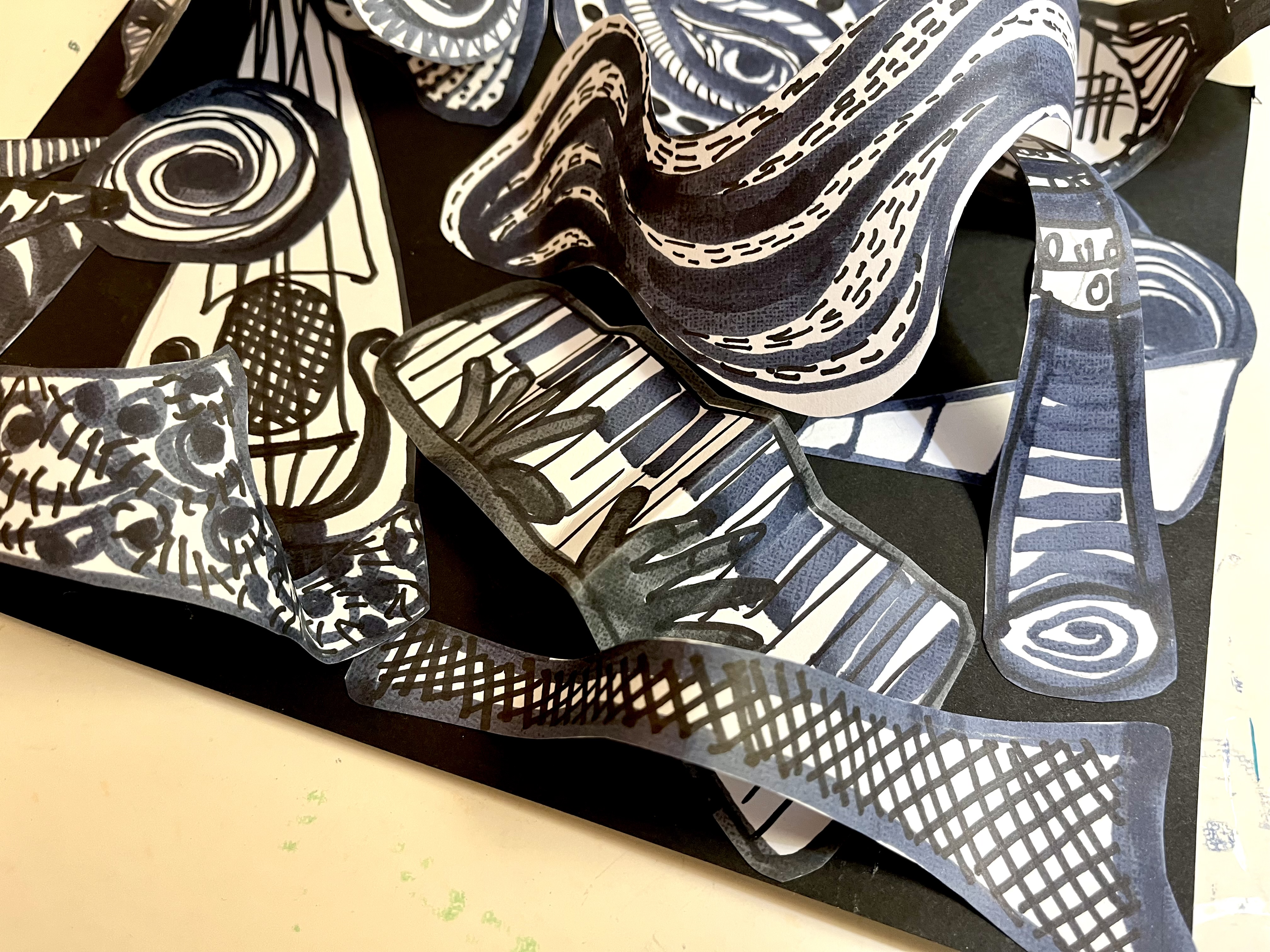
Before I even thought about it, circles became cymbals, the triangles-horns, the eyeglass shape--eyes, Paisley was just an teardrop eyeball--watching. My large long box shape became a keyboard, another long triangle became a mandolin/guitar.
 |
| oldnewgreenredo |
Once all the shapes were colored in...they were cut out...
 |
| oldnewgreenredo |
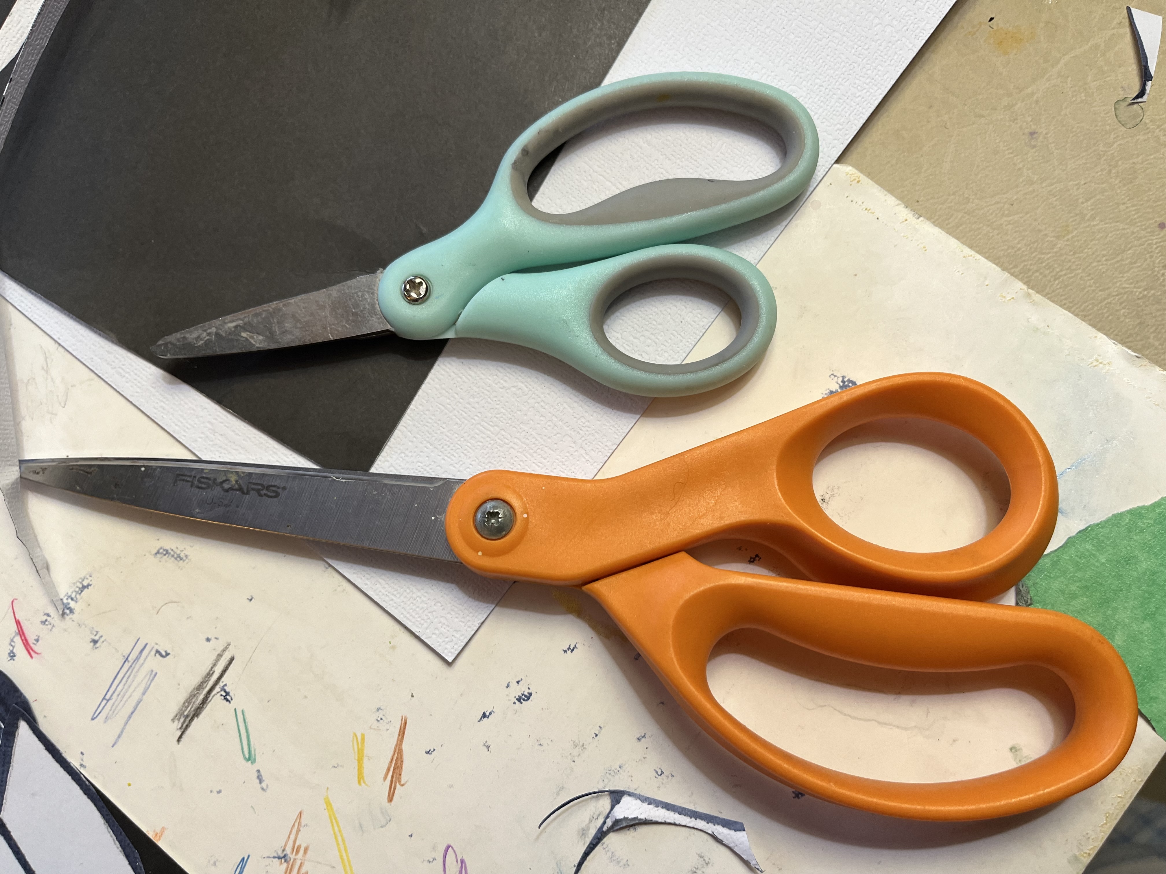
My scissors.


Pieces were bent, twisted, folded, arched and glued on and spilling off the paper with a simple glue stick. I used everything that filled
my 12x12 onto the 8 1/2"x11" base.
Those circular ovals became bongos up in the right hand corner. My one major organic shape is across the middle and is sort of an exaggerated music score, totally unintentional.
 |
| oldnewgreenredo |
1960's tie patterns across the bottom. Black hands on the accordian-fold keyboard.
|
| oldnewgreenredo |
Everything was glued with an Elmer's glue stick...
 |
| oldnewgreenredo |
Assembling was done in about 5-6 minutes...YIKES. Sometimes time crunching really is a savior...I could have pondered this to death.
 |
| oldnewgreenredo |
Personal Story: Black History has been on my mind this month as well as some great memories of 1964-5. My HS boyfriend at the time was a substitute clarinet player for the Chicago Symphony's summer orchestra. So, on Saturdays we would take the hour and a half trainride from Wisconsin to Chicago for rehearsal and I would sit in Orchestra Hall and listen to a 3-4-5 hour rehearsal of the Chicago Symphony.
 |
| oldnewgreenredo |
My BF had close acquaintances in the Orchestra and many times after practice we would jump in a cab and head to a club somewhere on Chicago's South Side with a young black trumpet player. Mind you we were the only two UNDERAGE or white folk in the place. My BF would jam with the jazz band of odds and end musicians playing, he'd borrow an Alto Sax (his favorite) and the music was amazing. The band and people were amazing, then we would take a cab to the train station and back home, smelling of smoke and who knows what else...?
"Gee, Mom...rehearsal was soooooo long, that's why we are late."
At the height of the Civil Rights movement surrounded with all the protests, destruction and anger---Music was still a safe space. I'm sure I would have been grounded for life, if my mom had known. I was a violin player, but definitely learned an appreciation for Jazz.
 |
| oldnewgreenredo |
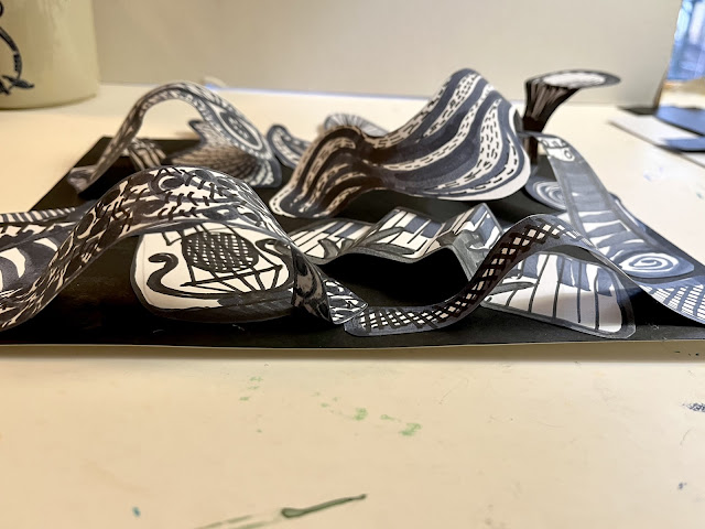
I think that is where all this came from...so it's titled "Chicago Jazz 1965". The clarinet was a long triangle and the bongos are up on the right.
|
| oldnewgreenredo |
Another shot from the top to see the construction.
|
| "Chicago Jazz 1965" S.Magle 2025 |
It's amazing where art or music can take you. I'm in the process of getting music into my work room. The doll room has classical on all the time, maybe upstairs I'll try some Jazz or Blues, who know where this will take me.
Mather Classes for Seniors can be explored HERE.
Thanks always for visiting.
I will try and respond to every comment and answer every question.
I'll be participating at these fun parties.
All the opinions and photographs in this blog are my own, I have not been paid or reimbursed in anyway for my opinions, posts or any products shown. Please do not use photos without linking back to this blog without my permission. Thank you for your cooperation, Sandi Magle
Sandi
 |


