Saturday, July 13, 2019

#WorldWatercolorMonth Day 13 Glassy Blue Ball Jars


Ad-Free Blog

Quick Post!  We were having company today, so I dashed this off in the middle of the afternoon...the photo was pretty late and the light had changed drastically. I started with a sketchbook paper taped down and worked basically wet brush on dry paper.


oldnewgreenredo

I use these antique canning jars for staples storage, I grabbed three filled with: beans, parsley and rigatoni noodles.

I worked very quickly---which was good, because after 2pm the light changes very quickly.
I did a quick sketch with Prussian blue/VanDyke Brown to give the grays and blue outlines of the jars and lines. The blues vary on the jars, the smallest one being the most intense in color.


oldnewgreenredo

Next I painted the Ball indentations on the jars, the middle one is very faint but it is is there. Adding the beans, parsley,  and macaroni. Very faint, then washes of blue and blue gray on top. Burnt Sienna was perfect for the rubber rings. The old-fashioned Zinc caps have interesting shadows on them...added a bit of washes and call it quits, my company was coming. I took the photos before the paper had even dried. 

Palette: (very limited in colors)

Prussian Blue
VanDyke Brown
Burnt Sienna
Lemon Yellow
Hookers Green
Carmine (for the beans) 

This was fun and quick, I had agonized over painting glass, but I guess charging ahead works, okay!
HOPE you had a Great Saturday!


Disclaimer: Any products I am using are not a recommendation, but only for reference for the reader's use. I am in no way affiliated with any of the companies or products, or have I received compensation or products. 


My painting projects will be posted on Pinterest, Flickr and Facebook with the hashtag


Friday, July 12, 2019

#WorldWatercolorMonth Day 12 Blooming things

AD-Free Blog

Hello, followers and new visitors. 


Hope some of you are visiting from WWCMonth. 
Please leave your site/or FB page in a mail 
or leave a comment with a link-so I can see your work. 

I can't imagine how many paintings are posted in a day---
it must be many thousands, and finding someone's work is hard!

I hope you aren't getting bored with this journey. This has been heaven-sent for me, since moping around the house because I'm limited in what I can do right now. Surgery for my knee won't be until October-November. I have some relief from a cortisone shot, but the knee itself isn't stable...so I spend more time being careful than doing ANYTHING!

Anyways, painting has been MIND therapy. 
If you are having any kind of stress/personal issues, find something you love to do---and DO IT, for yourself.

Theme, Blooming Things....I trundled outside and took a few photos as our remaining HollyHock went into full bloom yesterday. 
We've lost the red and pink ones..and all that remains is white. My D-in-law transplated some starts we had from the greenhouse, for me so hopefull next year we will have NEW colors. Hollyhocks are bi-ennials, so they bloom on the second year. So you really need to seed, or plant twice, to have blooming each year!


oldnewgreenredo

Here's my computer setup---with my painting started. The white areas were masked, and the yellow areas are where the masking still needs to be peeled off. 

I'm using Water color paper 10 1/2" x 14 1/2"
Strathmore 
Imperial 140# Rough surface 140-1

The WinsorNewton Masking  peeled off very easily on this paper. 


oldnewgreenredo

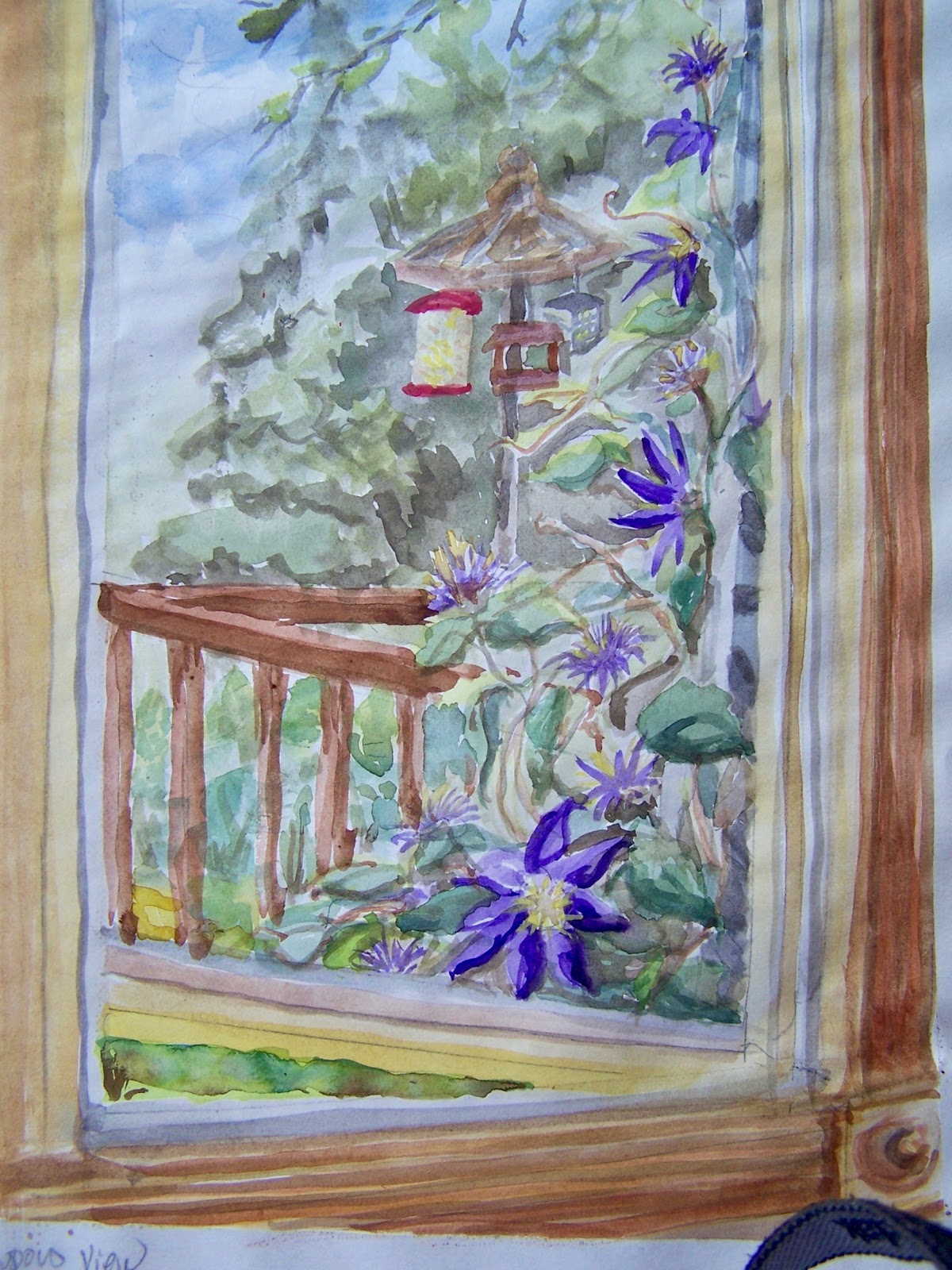
Here's one of three photos I worked from. If you have followed my blog, you know Chicagoland had a long, wet Spring, and everything is covered with a slick of mold/mildew or even moss. I actually hoed-yes sat down and hoed off a section of deck 
from 1/2" high moss! 
Crazy---we have never had mold/moss this bad before. 

When the weather is totally dry---
we will tackle all those areas, maybe not until Fall,
 because we have so much planted along this fence.
We also have a crop of bugs---chewing on everything--I chose not to paint the holes in the leaves, LOL (artistic license) 


oldnewgreenredo


A closer view of the half masked paper. I did do some quick pencil lines---and did heavy washes FIRST on the fencing. I didn't know how much this paper would buckle so I wanted my straight lines--straight! I had to work quickly though, because it's very absorbent paper and it buckled quite a bit.

oldnewgreenredo

Here all the masking has been removed and the darker shadows and a base for the fence is established. The wrought iron bed was just catching the sun...so I wanted to keep it lighter.

oldnewgreenredo

I worked on all the backgrounds and leaves first and then started on the  Blooming Flowers. 

Holly hocks are so gorgeous, these have a five-pointed green star
 in the center and then feathering out into pink/rose. 
Temptation to work the flowers over to death tempted me, 
but I walked away. 
Palette:
Cerulean Blue
Prussian Blue
Thalo Purple (which I used to mix shadows)
VanDyke Brown
Burnt Sienna
Lemon Yellow 
Lemon Green
Cadmium Yellow Deep
Hookers Green
Carmine red
I added: Sap Green
and Viridian green

AGAIN, I Hope some of you are visiting from WWCMonth. 
Please leave your site/or FB page so I can see your work. I can't imagine how many paintings are posted in a day---it must be thousands, and finding someone is hard and I would love to follow 
your hard work!

Disclaimer: Any products I am using are not a recommendation, but only for reference for the reader's use. I am in no way affiliated with any of the companies or products, or have I received compensation or products. 


My painting projects will be posted on Pinterest, Flickr and Facebook with the hashtag


Thursday, July 11, 2019

#WorldWatercolorMonth -Caught up days 9-11

PHEW....this will be a short post. I spent my extra time today painting three for the #WorldWatercolor Month challenge.

My Palette was getting empty---and in an effort to sharpen up my colors, I added Prussian Blue in addition to Cobalt and Cerulean,. and Carmine in the Thalo Red hole. Otherwise, I'm keeping the previous palette with these additions. I really need a bigger palette for mixing and keeping my colors pure.

I went back to sketchbook paper because I planned on these being quick!(ha, ha, ha)

Day 9 Shadow Play

I set up my Brush pot and my water glass, just as it was on the table, and I kept stealing the brushes and bumping them around. The pot is a large stoneware, cheese crock that once had a lid. The cup is a lime solo cup---! We keep it simple around here.


oldnewgreenredo

I tried to keep this simple, the shadows were concentrated on the blue pot. Shadows and reflections are interesting to play with. Here you can see the cobalt, cerulean, Prussian blues with the Thalo Purple for some of the shadows. 


Day 10 Ocean Creatures 

I included coral in this because it is a living creature and sadly disappearing, a few other critters are hiding as they do Unda-Da-Sea, (that song played in my head the whole time, such restraint to not paint a clown fish, also...LOL)


oldnewgreenredo


There's a crab and a few other hints of things. I went for lots of texture here and plants. I might use this theme in the future for some watercolor paper, something rough. 


oldnewgreenredo


Day 11  Simple Pleasures  

At our age, the first thing in the morning is a huge cup or two or three of coffee and a bit of cream. 
I have these huge red stoneware mugs that are nice and thick and keep the coffee hot---what could be more pleasurable? All my dishes are blue, red,  or blue and white. So, you see a lot of them. 
The cup has Thalo Red, Cadmium Yellow Deep, Carmine and Burnt Sienna. Lots going on for one cup of Pleasure...

Hope you had some fun today, I sure did. 


Disclaimer: Any products I am using are not a recommendation, but only for reference for the reader's use. I am in no way affiliated with any of the companies or products, or have I received compensation or products. 


My painting projects will be posted on Pinterest, Flickr and Facebook with the hashtag


Wednesday, July 10, 2019

#WorldWatercolorMonth Day 8 Flying High Theme

Ad-Free Blog
Well, is it hot by YOU? 
After three gorgeous days in Chicagoland (we almost got caught up on the yard work), today was beastly. So, inside my intention was to paint three pictures today and get caught up for the watercolor challenge. One painting for each day, following a prompt.

"Flying High" Day 8's prompt brought to mind all the kites, balloons, airplanes, birds, and then my husband said "drones", and I had to laugh. 

oldnewgreenredo

I started to think of photos I had taken over the years, I did lots of nature photography I used for poems. And, one came to mind, 2007 from the Chicago Botanic Gardens. Waterlilies in all their glory.

When I originally blew up the photo to use as my screen saver, I noticed the feather.

oldnewgreenredo
Here's the original photo---


Here's the photo cropped and blown up. I wrote a poem about a lover leaving....the last evidence the feather or evidence of a flight. A bit far from the prompt...but this is what my mind came up with.

oldnewgreenredo
I treated myself and used a cut down piece of 
Strathmore Aquarius II 80lb cold press 132. 

Size about 10 x 12". Here is the first washes after I did a rough sketch and applied masking to the white(showing as light yellow) areas(the flowers, feather and a few places where light bounced off the leaves). For the washes, I tried to use brighter hues, knowing there would be a more layers of color.

oldnewgreenredo
I let this dry, and later did another wash with some outlines and deepening colors. I used colors over water spritz, working on one area at a time. Our air was very dry, so I had to keep spraying on water.

oldnewgreenredo

I let that dry and then peeled away the masking(this was really hard to get off this paper) and began working on all colors, deepening, and outlining. After adding some details, and taking away others, by over painting, I stopped. In college my painting (acrylics/oils) professor set me up with three easels, to keep me from working so fast and muddling up the colors. I did learn to walk away from works in progress.

oldnewgreenredo

Here's a closeup...I have distorted the proportions to the original photo, but I was trying to stay true to my thoughts on the meaning behind the composition, or should I say nature's composition.
Don't forget to look at some of the other paintings at #WorldWaterColorMonth on facebook or DoodleWash.
I'm learning so much by seeing all the great paintings.
Palette:
Cadmium Yellow Deep
Lemon Yellow
Yellow Green 
Viridian Green
Cobalt Blue
Cerulean Blue
Thalo Purple
VanDyke Brown
Burnt Sienna
Lamp Black
and I added Hooker Green


Disclaimer: Any products I am using are not a recommendation, but only for reference for the reader's use. I am in no way affiliated with any of the companies or products, or have I received compensation or products. 


My painting projects will be posted on Pinterest, Flickr and Facebook with the hashtag


Tuesday, July 9, 2019

#World Watercolor Month Day 6-7


Ad-free Blog


This is a great challenge for all levels of skill, love the idea of world-wide sharing, and all the posts are fascinating on some level. 

Today was another gorgeous day here in Chicagoland, so I spent quite a chunk of time outside doing yard work from a chair. I have to stick to flat areas, because of the trashed knee. We are still behind here, losing time in April and May to cold and most of June to Rain, our yard work is way behind. Tomorrow I plug in the pump for the pond, and finish cleaning up the back deck. 

Day 6 Window View

We bought our home because of the windows. Three floor to ceiling panels in the living room and huge 96 to 108" wide windows in the bedrooms. The kitchen has two LARGE windows and a small sink window. Our screened-in porch has 14 windows and 2 exterior doors with windows...So, I guess I have a lot of window views to choose from. This made the decision very hard. But, I have been painting at the kitchen table and peeking through the clematis lattice at the bird feeders. The clematis is almost done, but a few blooms are still going.


oldnewgreenredo

This photo is from late in the day. Lots of wood...and the porch railings, the lattice and the feeders in the background. The hose can be eliminated, and I have a few photos of the clematis in full bloom, just not from this angle, I can draw inspiration from

I started with a 9x12 sketchbook paper and drew some pencil lines. Nice part about artistic license is you can add and edit...things from real life...like the blue hose---handy, but a bit jar-ing!


oldnewgreenredo #WorldWatercolorMonth

So I started early in the day---I didn't take progress photos--I was too engrossed in painting layers, and layers.  I didn't use any masking---I wish I had, because I painted the clematis first and then everything else. This photo above is taken from the east light. 

oldnewgreenredo #WorldWatercolorMonth

And this was from the south windows, shaded by the garage which is out of sight---amazing what four feet will do to your colors.  I broke one of my own rules, when you use a color like the red in the bird feeder---you should use it somewhere else???...I just couldn't work it in. The black at the bottom is my camera strap...UGH!

Problem: How do you do straight lines/architecture when you have paper that buckles? I did sketch in pencil---very straight lines of the window parts.If I do this again, I will use something other than sketch paper and LARGER, so I can be a little free. 
Note: this palette is basically what I have been using for all my paintings, and it seems to work well for the summer light--- I mix most of my colors, but, I could use a really dark green. Mostly I need a bigger plastic palette. 

Palette:
Burnt Sienna
Cadmium Yellow Deep
Lemon yellow 
Thalo Purple
Cerulean blue
Cobalt blue
Lamp black
Viridian greeen
Yellow Green
VanDyke Brown
Thalo Red

Day 7 Shiny Things 

When I'm really into a project, I forget to take photos...such as doing a watercolor of this old tarnished/patina teapot. Those of you who follow my blog have seen this teapot found in a thrift store, many times.  It really is one of my favorite pieces, and it moves around our home with with tarnished elegance. Like one of those old ladies dressed in her well-worn finest...a bit tattered, but still beautiful.


I took some license with the colorations, but you can see the golden glow even in the evening---though the handles, spout, and feet are cast.and darker than everything else, I love the details so these I added to the pot. I don't usually work this tightly, but the brushstrokes, became intense caresses on a beautiful object.

Palette:

Cerulean blue
Cadmium Yellow Deep
Thalo Red
VanDyke Brown
Burnt Sienna
Lamp black

no masking and on 9x12 sketchbook paper.


I think I may use this in another painting, or two, or three...what do you think?


Disclaimer: Any products I am using are not a recommendation, but only for reference for the reader's use. I am in no way affiliated with any of the companies or products, or have I received compensation or products. 

My painting projects will be posted on Pinterest, Flickr and Facebook with the hashtag

#WorldWatercolorMonth