Showing posts with label painting challenge. Show all posts

Friday, August 2, 2019

#WorldWaterColorMonth! Day 30 Wild Things: Learning to Fish

Ad-Free Blog

Day 30---ONE MORE TO GO...

I splurged yesterday and bought an 18x24 Canson Water Color Pad 140# Cold Press paper,
 at 40% off. Art online stores charge for shipping unless over $50.00, so this ended up being 50 huge sheets for $23.40. Besides I got to touch it...and liked the feel and thickness of the paper.

This is still student grade---but reasonable enough I can let the Grand paint on a Big scale too. 

My challenge today was to paint Wild Things, I had just done a frog---from our pond. Then I thought of the Raccoon, that dragged clams up from the lake---(2 blocks away) to wash them in our pond, after cracking them on our rocks. Also probably the same raccoon that stole all the goldfish we put in the pond one year. 

Then I thought of my son's cats who were feral kittens and are still wild at ages 14. They are big orange and white tabby now--one striped and one patched, so this is imagined
 Leo, "Learning to Fish".


First, working on a big space on good paper is very freeing. 
Layers and layers of color washes built this up. And it quickly dried enough to take as many layers as I could put on.  Learning when to stop---I think that is the biggest lesson of this painting.


Second, I chose a huge 1 1/4" Mop brush and an old squirrel bamboo brush. The bamboo is a 1/4" brush. Both were originally purchased for ceramic under glaze and glazes. The mop is at least 30 years old, the label is gone, but it must be a synthetic to hold up to glazes. The bamboo brushes I would use up in 6 months because glazes are really grainy and damaging. 

The Mop carries a ton of water, but also makes wonderful shapes when you twist and turned it, All of the goldfish was painted with the mop---except for the eye detail. I was having too much fun to take a series of photos. 


The fish is one of those ugly koi--not the carp ones, but the one with bulgy eyes and lumpy bodies. We don't have koi in the pond, no sense feeding the raccoons.

The paper was very absorbent, held it's shape, I used the smoother side which was still a bit textured. I'm anxious to try the rougher side tomorrow. 


I would have like to work more on the eyes...but I know you can really screw up a painting or a drawing...going in for the one last bit. 

I had filled up my palette with some new colors by Grumbacher Academy and
 Winsor Newton.

Palette: Lemon Yellow, Cadmium Yellow Deep, Cadmium Yellow Pale, Yellow Ochre,Alizarian Crimson, Winsor Red, Sap Green, Hookers Green, Cerulean Green, Manganese Green, Prussian Blue, Cobalt Blue, Thalo Purple, VanDyke Brown, Burnt Sienna, Lamp Black. 

The palette looks like I used everything. Well, did Leo catch a fish...of course not---!
Hope you are enjoying summer! 

Please visit Doodlewash  
if you are interested in starting to watercolor. There are lots of talented and beginners there, and the community and shared information is wonderful. There are continuing challenges to get a newbie or pro to paint!

I'm not advertising, I just think this is a worthy cause:
Please don't forget Dreaming Zebra Foundation
 the above supports art materials for children...
take a peek.

Disclaimer: Any products I am using are not a recommendation, but only for reference for the reader's use. I am in no way affiliated with any of the companies or products, or have I received compensation or products. 

My painting projects will be posted on Pinterest, Flickr and Facebook with the hashtag 


Thursday, August 1, 2019

#WorldWatercolorMonth! Days Days 26-29

AD-Free Blog

Wow, sometimes life gets in the way. Between catching up in the garden, therapy, listing many new items on Etsy(research), driving, and trying to resume some real life--last week got away from me. 

We have some beautiful weather now in Chicagoland, so I moved off the kitchen table out onto the porch to paint with windows surrounding me. This is really ideal, no direct sunlight except early in the morning and lots of room to spread out. I'm sticking with the suggested prompts. I need some sort of discipline, because I have none of my own, LOL. 


ONLY TWO MORE, after this.


Day 26 Natural Wonders. 
Between the woodchuck under the kitchen porch, the possum under the deck, the gazillions of birds (we feed them), the hippies, squirrels, we have a small pond and frogs. So we have 'Natural Wonders' everywhere. Our frog this year is tiny--but we never know when a big one may show up, we have had large fat happy frogs in the past. I worked this pretty wet, spritzing water in various areas and letting the paints spread.

Palette: VanDyke Brown, Cerulean Blue, Prussian Blue, Prussian Green, Lemon Yellow, Cadmium Yellow Pale, Thalo Purple, Cobalt blue,Lamp Black


Day 27  Fruits, 
I worked this very wet---you can see the paper has buckled. In a way it helped with the translucence of the glass but I lost the plate/bowl. I wish I had just done the glass, but the watermelon piece and rind looks nice and juicy. 

Palette: Prussian Green, Yellow Green, Lemon Yellow, Cadmium Yellow pale, Lamp black, Prussian Blue, Cobalt, Alizarian Crimson, Winsor Red,


Day 28 Mettalic

This was fun---it's a galvanized metal drink dispenser, we only use it for Water when we have a big group. Late in the day and with two light sources on it, there were tons of reflections and variations on the surface. The shadows kept changing, so my colors did too. I tried to work loose and not overwork anything.

Palette: VanDyke Brown, Thalo Purple, Prussian Blue, Burnt Sienna, Lamp Black, Cadmium yellow Pale.


Day 29 Glorious Green

Our whole yard is green, this is the back corner of our garden where the squash plants are going crazy, climbing up the fence. Sometimes they make it to the roof of the neighbors shed and make their fruit up there. It's very late for the garden this year, we hope we get some ripe squash, they are great keepers and we usually have squash until spring  in the cabinet designed for potatoes,onions, etc. This was worked very wet with built up washes and lots of over painting.

Palette: VanDyke brown, Prussian Green, Hooker Green, Lemon Yellow, Cadmium Yellow Pale, Prussian Blue, Lamp Black

I'm planning on posting one painting experience a week, when this ends. Please visit Doodlewash  
if you are interested in starting to watercolor. There are lots of talented and beginners there, and the community and shared information is wonderful. There are continuing challenges to get a newbie or pro to paint!

Please don't forget Dreaming Zebra Foundation
 the above supports art materials for children...
take a peek.

Disclaimer: Any products I am using are not a recommendation, but only for reference for the reader's use. I am in no way affiliated with any of the companies or products, or have I received compensation or products. 

My painting projects will be posted on Pinterest, Flickr and Facebook with the hashtag 


Thursday, July 25, 2019

#WorldWatercolorMonth! Day 25 Shades of Pink

Ad-Free Blog

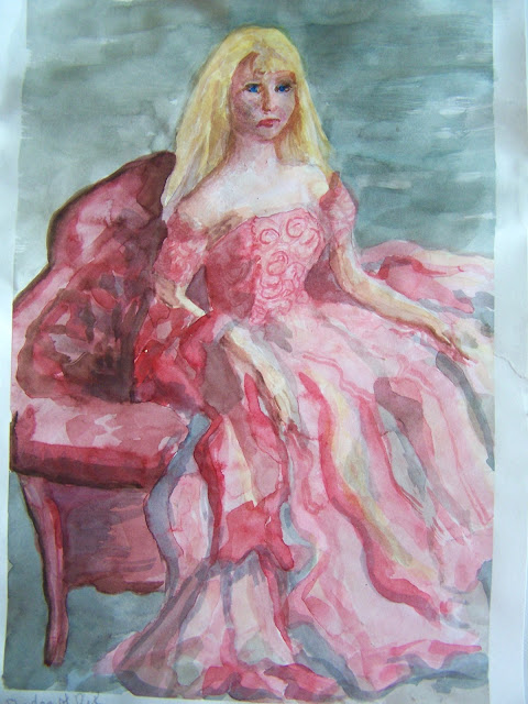
So, Today's theme is Shades of Pink, which of course made me drag out one of my dolls. Since I didn't have a computer---I thought painting from a doll was better than making it up...


I worked on sketchbook paper---because I haven't done any watercolor portraits, and I look at my watercolors as a 
LEARNING EXPERIENCE!


You can't grow, unless you give yourself permission to learn!

I hope you can see my faint sketch---I wanted the subject to look like a real person, 
so I thickened her arms and neck, Barbie tends to be 8 foot tall and skinny!


She is one of my vintage (OLD) favorites. 
Her gown is white, but I figured I could go pink without any big issues.

Palette: 
Thalo Purple
Prussian Blue
VanDyke Brown
Burnt Sienna
Lemon Yellow
Winsor Red
Alizarian Crimson

I worked mostly with synthetic 1/4", 5/8", 3/4" flats  and a very small round at the end for detail. Most of my brushes are so old, I can't see the brand names on them. Basically I use good quality synthetics originally designed for acrylics and craft painting. I like a brush that doesn't go limp, so the stiffer acrylic brushes are fine.


I did the background (Prussian Blue, VanDyke Brown and a touch of crimson) lightly first ---I tried to use Alizarian crimson in all my color mixtures---to go with the shades theme. At this point, I knew the white hair wasn't going to look real,
so I planned on blonde. 


This is basically after the first layers of color. And here is where my memories started to take over. 
I was 15 again, at my first formal---awkward, ( I was never a girly girl) so dressing up was a challenge.) I loved clothes, but more from a design point, rather than wearing them.


This dress is far more sumptuous than anything I ever had...I tried to do the lace on the bodice. Then, the face became an issue---she wasn't happy---probably because of feeling awkward. 
This photo was of wet paint.

I later added some yellow/pink in the dress to go with the hair. Thalo purple, VanDyke Brown, and the Alizarion Crimson were mixed for the darker shadows. 


I finally had to walk away---wait until the saturated and muddy paper dried. Sketchbook paper does have an end point!  I eventually dry-brushed in some of the details
 and then walked away.

IF I do a portrait again---I will use some fabulous paper---that I can rework, when I get into trouble. 
I did manage to rework her mouth. 
I still love the memories represented here: the rustle of the fabrics, the heavy colognes everyone wore, the sticky hair, the heat of the room mixed with teen angst---all rolled up into one portrait. 

Do you remember your first formal event? 

Disclaimer: Any products I am using are not a recommendation, but only for reference for the reader's use. I am in no way affiliated with any of the companies or products, or have I received compensation or products. 

My painting projects will be posted on Pinterest, Flickr and Facebook with the hashtag 


Don't forget the above supports art materials for children...
take a peek.


#WorldWatercolorMonth Day 24 Sweet Treats

Ad-Free Blog

Well, here's another one! Thank you for staying with me---today's theme is Sweet Treats---which is great. I chose to do three mini pics---to use as artwork eventually for the cafe in my Barbie Hotel. Which I hope to be working on soon. Barbie scale painting!


Again, I'm using sketchbook paper---these are going to be quick, hoping not to get too complicated and overworked.


Here you can see my faint sketches---and some yellow/resist, 
that I will peel off after painting for highlights. I wanted a polkadot cupcake paper--and figured this was easy way-out for white dots.

Palette:
Cobalt Blue
Prussian Blue
VanDyke Brown
Burnt Sienna
Alizarian Crimson
Cadmium Yellow Pale
Lemon Yellow
wax resist 
I'm painting with a couple of synthetic 1/4"- 1/2" flat and a small round, background a very old hair wash 1" brush.


I really kept these simple as they will be shrunk down to about 1/4 or less the size. You can see the resist---yellow dots and some strokes in the pink icing, highlights on the cappuccino cup.


This is a closeup, the plaid cloth is just a few strokes on wet paper and then dry brush enhanced.


This lemon blueberry cupcake has a candied lemon slice on top--had this once-to die for.


Capacinno cup---is fun---the yellow is still the resist--I removed it in the final shot, after a bit of detail, the TREATS are done!


The paper is a bit curved, distorting the cup.
I think I have to iron all my sketchbook paper paintings. 
Next, I peeled off the resist, 
and used the white areas to make my highlights.
I added darker blue to the blueberries, the raspberry frosting is eh---but I bet it tastes better than it looks. 
I imagined the cupcake to be a nice mocha chocolate, with raspberry icing! 
Hmmm, I think it needs a raspberry on top, and a leaf.

So what's your favorite treat---!

Disclaimer: Any products I am using are not a recommendation, but only for reference for the reader's use. I am in no way affiliated with any of the companies or products, or have I received compensation or products. 

My painting projects will be posted on Pinterest, Flickr and Facebook with the hashtag 


Don't forget the above supports art materials for children...
take a peek.


Tuesday, July 23, 2019

#WorldWatercolorMonth! Day 22-23

Ad-Free Blog

Working out of the same palette as the previous post---

Day 22  was Rainforest.

Trying to loosen up, I started with heavy washes and floating colors on select areas of sketchbook paper.

I was working with a long 3/4 flat brush---and just sort of lobbing the color on, the fronds are painted on a dry area.


I painted this whole painting with the large brush...it has a sharp edge one direction and then pulled the other way it widens out. I dabbed out some extra color and reapplied it with a sponge.


Colors look different here---I did some water spritzing to unsharpened some edges.


I floated some red for suggestions of flowers...and did some more water...this was  an interesting experiment. Tried melding some red into the greens for shading? Successful in some areas and not in others. 
I've never been to a rainforest, and probably never will, so this is reminiscent of the Chicago Botanical Garden greenhouses. We love visiting in winter when the orchids are in full bloom, but it is gorgeous all year round.


Day 23...Beach  Hometown shoreline, painted from memories

Worked on sketchbook paper, lots of water to give the misty feel of the lakefront.


I grew up in a city on the west side of Lake Michigan. Not all beaches are broad and smooth. North of town we had sand and gravel bluffs thirty to forty feet high  covered in waist high grasses. Beaches were stony, full of driftwood, glass and debris.  The stone jetties by the zoo are gone now---and were falling apart in the 1960's. I remember these three south of the lighthouse which I believe are still there some distance south to stop lake erosion. 

The point and the lighthouse is named Wind Point...there has been a working lighthouse here since 1880. It's one of the taller and older light houses on Lake Michigan and still used for navigation.
I painted this from memory as my computer was down. I'm remembering what would have been somewhere along the coast probably from the golf course south of the lighthouse, 
or a combination of sites. 

My memories are rich, I can remember the seagrass, gritty sand, acres of rounded rocks, thrashing waves when the tide(yes, the great lakes have a tide), the scent of the lake water...and a long walk up the bank hanging onto thick grass to pull you up. 

Disclaimer: Any products I am using are not a recommendation, but only for reference for the reader's use. I am in no way affiliated with any of the companies or products, or have I received compensation or products. 

My painting projects will be posted on Pinterest, Flickr and Facebook with the hashtag 


Don't forget the above supports art materials for children...
take a peek.