Showing posts with label watercolor pencils. Show all posts

Thursday, June 12, 2025

Thrifty Art Supplies

Ad-Free Blog

Finding Bargains in Art Supplies. 

I shop everywhere. Having been involved in arts and crafts most my life, I know how expensive it can be to buy new art supplies.
So, I keep my eye out at thrift stores, as well as closeout aisles, sometimes kits and everywhere else... for something I might need. Not that I buy new all the time...I don't.

oldnewgreenredo

How many pencils is too many pencils?
This is my current regular colored pencils stash! I also have a set of Derwent Soft pencils in a set that was purchased after Christmas, cheap. Those blend very nice, but are soft and smudgy and not for details.

What I really needed was some watercolor pencils.


oldnewgreenredo

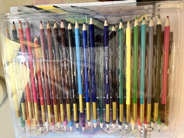
Since this is OldNewGreenRedo, recycling and going green is always recommended. I just had to pick up this double set of pencils, lightly used, missing one of  the regular pencils and another side with...

oldnewgreenredo

...all watercolor pencils. These are all Artist Loft, Michael's store brand for student quality art supplies. Well, but $2.99 ...was just too good a price at the local thrift store. (I priced a similar set at Mike's today, $24.99 just for the Watercolor set.)

oldnewgreenredo

Wow...and this is a complete set...only the red and pink had been used a little.

oldnewgreenredo

This WAS my pitiful selection of Watercolor pencils, before, and the green keeps on breaking, the blue is missing? Where do pencils go, same place as dryer sox?  

I will probably do a few pages of scribbles to assess which ones work the best.  I plan on doing some daily sketches in colored pencil and micropoint ink pens or drawing pencils.

HAPPY THRIFTING and PENCILING? is that a word?


All the opinions and photographs in this blog are my own unless identified, I have not been paid or reimbursed in anyway for my opinions, posts or any products shown.  


Thursday, May 29, 2025

Sketchbook Revival BingeFest: Mixed Media Flora Studies with Joy Ting Chardre

 Ad-Free Blog

Mixed Media Flora Studies with Joy Ting Chardre  

Sketchbook Revival BingeFest 2025...this is an online signup free for access to some older tutorials by different artists. A month worth of projects and over 5 years. So that is 131 tutorials to choose from to do in a limited amount of time.


I loved working with Joy, and I really worked on this for maybe 1hour and 45 minutes. The tutorial was roughly a bit under an hour. Joy is lovely and so expressive in speaking about her art and taking some of the fear away. Using sketchbooks as a stepping stone and a license to experiment on techniques and materials.

oldnewgreenredo

This was the perfect though complex first project for me in this series. I'm too cheap to enroll in the 2025 month...but they offered free access to 5 years worth of old tutorials. So I'm picking and choosing which instructors and projects I'm going to work on, emphasizing mixed media as well as watercolor...and maybe just something different. 

oldnewgreenredo

The project focus was to work from a clipping/photo or old artwork, and do a couple of quick studies for colors. 

I chose a 1/2 page scrap clipping from a Fructose Magazine. I don't have the name of the original artist. I love the dark and bright of the colors in this photo of artwork.

oldnewgreenredo

Drawing some small rectangles on my sketchbook, leaving an area open to the side for color ID and color mixing. I experimented with the colors I had on my palette.

oldnewgreenredo

These three palettes were all loaded with the same 3 colors...a crimson, a yellow and a cerulean blue from a watercolor play session with my grandgirl and d-in-love.
 These watercolor tubes were from an inexpensive set from Michael's in an art kit that included an easel, watercolors set, acrylic set, brushes, palette, drawing pencils, paper, and a portfolio. It was one of those Christmas specials...that went on super sale right after the holidays. Basically the cost of the Large portfolio alone.

In one of the three palettes I had originally added some burnt umber. Everything else was mixed from these basic colors. It's surprising how many colors you can get doing it this way.

oldnewgreenredo

After about 20 minutes of mixing and playing with some of the flowers, 
oldnewgreenredo

we were encouraged to do a full size page of some detail from our source photo.

oldnewgreenredo

I lightly sketched with water color pencils. After the sketch was laid out, I used alcohol markers in Dark Gray and Dark Blue to do the background before I painted.  One of the things I couldn't do with the limited palette.

oldnewgreenredo

On this version I also added the small pans of color. I used the upper left blue, a dark teal green and some of the dark browns. This was a inexpensive kit from Walmart, I think.

oldnewgreenredo

The multimedia came in with the colored pencils worked here and there, a charcohl pencil, and I tried several different white pencils, along with some greens and yellows for highlighting. 

oldnewgreenredo

Pencils are charcohl, Prismacolor soft, and watercolor pencils by Artist Loft, Michael's store student brand.

oldnewgreenredo

I was intrigued with the Eucalyptus that was lavender in the scrap photo, but it morphed into greens to balance out the cabbage leaves. The grays in the thistle were balanced out in the dark foreground. Making a large scale subject matter in a small space is always tricky. Composition has to include positive and negative space. I chose the elements I was interested in working on and tried to place them in a cohesive compostion.


oldnewgreenredo

Total working time about 1 hour and 40 minutes for the quick color sketches, the tutorial, and working through the tutorial on the larger page. I did a bit of pencils at the end...the soft Prismacolors work well on top of alcohol ink as well as watercolors. 

I'm going to make sure I look for any other tutorials Joy did over the last 5-7 years.

Please ask any questions...as it's really hard to do photos when you are working from a tutorial. 

But Remember, first of all, 

Most of all------HAVE FUN!!!

All the opinions and photographs in this blog are my own, I have not been paid or reimbursed in anyway for my opinions, posts or any products shown.  


Creative Mindfulness Mather Class: Henri Matisse's Goldfish Bowl in Multimedia

Ad-Free Blog

Mather Creative Mindfulness: Henri Matisse inspirations

I was so excited to start this project, I actually worked ahead a bit. Henri Matisse was was a late 19th Century Artist who worked up until the early 1900's. Todays' inspiration was the Goldfish Bowl from 1912.


Pinterest
L
at Our instructions today were to watercolor a goldfish bowl on Watercolor paper, and then cut it out and place on black paper cardstock, then draw a background. 

I used simple water colors...on my bowl shape. I forgot to take any photos of that process..

oldnewgreenredo

You know when you are in the zone you forget everything. I used this palette.

oldnewgreenredo
 

and also watercolor pencils to use for sketching. The white and yellow worked well on the black cardstock.
oldnewgreenredo

I started sketching with Colored Pencils....just to get a feeling of where the background would be...a table a plant and brown legs to support a table. We were encouraged to make a colored patterned background.

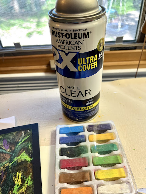
I grabbed what I thought were oil pastels for their brilliance, but found it was an unmarked set of basic soft pastels. The colors seemed brilliant...until...

I'll explain later.

oldnewgreenredo

With only 45 minutes to work on this, I fussed with the table top...I haven't done much work on black papers, but it is fun...and definitely developed a different take.

I imagined an old tablecloth with some lace edging, I thought would be interesting. 

A terra cotta pot with two kinds of plants in it and a striped wallpaper and anchoring the whole thing, two big knobby legs on the table. The colors seemed very bright but the soft pastels were very messy and I grabbed my sealer and didn't look at the label. Workable sealers are great for pastels, it seals what's on the page so it doesn't smudge or mess and then you can work again on top of it. But, this wasn't workable sealer.

oldnewgreenredo

It was a can of regular sealer for wood, plastic, or finished PAINT surfaces...DUH!

oldnewgreenredo

The result was...it drowned out all the brilliance and depth of the pastels and melted it.The purples I used for shadows and design in the wall paper all but disappeared. The orange wood tones in the legs and highlights of yellow disappeared. 
Lesson learned. I worked on top and again, sealed and same thing. But, the watercolors got more brilliant, 
LOL. Another Lesson learned.

oldnewgreenredo

Again ,I worked over with white soft prismalcolor pencils.

oldnewgreenredo

You can see the dark green melted on the black paper, but not on the watercolored bowl.

oildnewgreenredo

I played a bit and dampened down the colors on the bowl with some smudging of some pastels so toned down, it matched/blended a bit more with the background.

oldnewgreenredo

I may try this all over again...with the proper sealer OR with Oil Pastels.

oldnewgreenredo

Definitely a learning experience...we choose our own materials on these projects so it isn't Mather's fault...but live and learn...and now to go find my

Workable Fixative for Pastels, 

I know I have a can somewhere! 

Really nice article on Henri Matisse's 'Goldfish' HERE.

Have you Tried anything NEW Lately!

No class the week of Memorial Day...so I'll have to find something else to work on. 


All the opinions and photographs in this blog are my own, I have not been paid or reimbursed in anyway for my opinions, posts or any products shown.