Ad-Free Blog
I just finished my second week of my Mather Introduction to Watercolor Series. The first week was basically BASICS...materials: water colors, papers, brushes, and tape, surfaces...etc. I'm doing my notes and tests in an all-media good quality sketchbook.
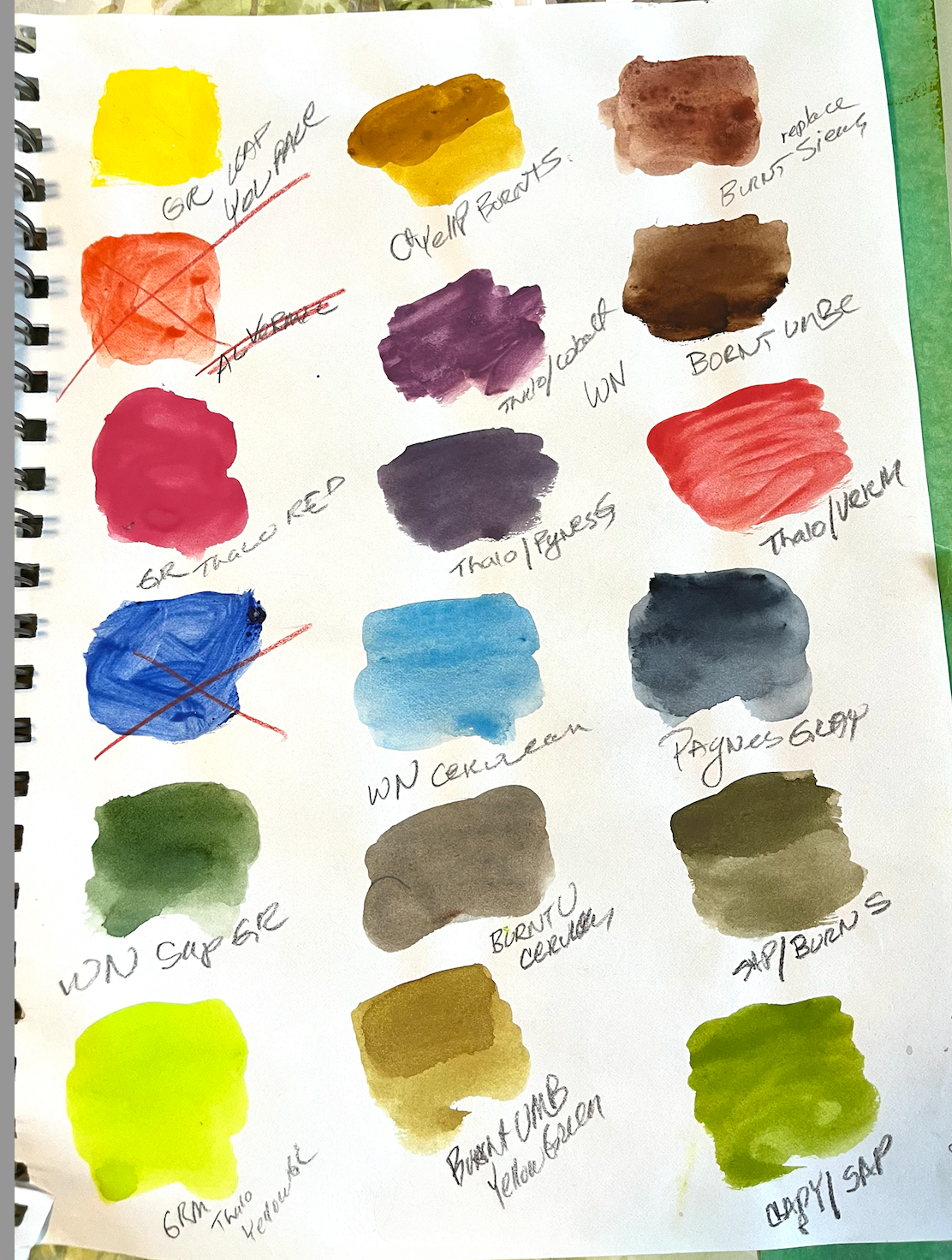
I jumped the gun after the first class and did this sample of the colors recommended, and a few trial mixes. The crossed out ones are tubes of acrylic, mistakenly mixed up.I'm lucky in that I have so much craft/art/crap. I didn't have to go buy a thing, but I am still looking for my bottle of masking liquid, which is somewhere. I probably won't need it for a while. I replaced the Cobalt Blue with Prussian Blue for this palette and mixing.
My first palette was the recommended colors at the top L to R
Cadmium Yellow Light
Vermillion
Thalo Red
Burnt Sienna
Burnt Umber
Cobalt blue (my choice extra)
Yellow Green
Sap Green
Cerulean blue (extra)
next skip this was Acrylic
Paynes Gray( a very dark blueblack)
Prussian Blue
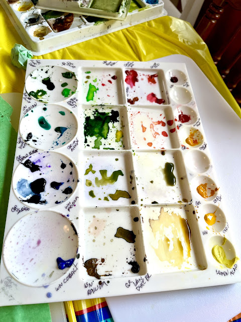
Ignore the labels on this palette, they are actually from my ceramic underglaze painting days. I'm going to remove them and re-label with a Sharpie which is waterproof but can be removed with alcohol to keep my palette straight.
Long as I had all that paint going in the palette for the mixes I did on the paper, I figured to try something to practice mixings with an imaginary landscape.
After class I played with this painting for a few days, trying to build up layers of color by using the colors we were starting with and the mixes from my tests.
It wasn't planned and I just tried to use the primaries for sure, and all the supporting colors...SOMEWHERE! Basically the painting started out with Blue, Yellow and Red and evolved from there...a good exercise in mixing and value or weight of a color. I found I really liked using the Paynes Gray rather than black for tinting all of the colors and for washing areas.
SECOND WEEK Color Theory and Mixing
I was really ready for the Second Week which was Color Theory and Color Mixing: and analyzing exactly what your own specific watercolors will do.
I put at the top of the page the basic colors from the list.
Cadmium Yellow Light
Vermillion
Thalo Red
Burnt Sienna
Burnt Umber
Cobalt blue (my choice extra)
Yellow Green
Sap Green
Cerulean blue (extra)
skip the next was acrylic
Paynes Gray( a very dark blueblack)
Prussian Blue
Our first lesson was pretty much mixing colors from the Cadmium Yellow Light, Thalo Red, and the Prussian Blue. You start by using a plate to make a circle...then divide into 12 sections.
Primary colors
Yellow 12o'clock
Blue 4 o'clock
Red 8'oclock
Secondary is mixed
Green (Yellow/Blue) 2 o'clock
Violet (Blue/red) 8 o'clock
Orange (Red/Yellow) 10 o'clock
The rest are mixed from their neighbors.
It's important to make color wheels from your own paints, because that is what you will be using when you actually do your art. I wanted to use some Paynes gray to see how it mixed with every color. I used that on the outer rim of my color wheel, providing some interesting colors that will be great for shadows, and now I have a reference for Paynes Gray as it is very strong.
The second ring from the outside is the primaries, and secondaries, with neighbor mixtures between each of these.
The inside rings are mixed with the each color with its opposite on the wheel--(arrows in closeup) so under the yellow is a the color with more yellow + the purple from across the wheel. On the Purple side is more purple + less yellow. These are great for shadows and highlights. I was actually surprised at some of the colors that evolved from mixing these, all some sort of browned/grayed tones even sometimes green tones.
Some pigments are really stronger and you need to mix a bunch of different tests to get the full range of color. The more water you add, the more faded the colors are.
The P's are for Primary, the X's are secondary colors--theoretically equal parts of each primary. The others are mixtures of the Primary and Secondary color next to them. I drew the arrows to do the complementary mixes to keep myself straight.
I really used a lot of pigment in my color wheel spaces as my paintings are so faded and I want to get BRAVER and BRIGHTER!
After this, I dug in my stash....I'm guilty of buying paints when they are in those sale bins at 70% off. Watercolors have a long shelf life, and sometimes can be reground if they dry up.
PS. You can never have enough greens when doing landscapes.
This is my stash of miscellaneous paints. I had lots of brands and lots of different colors. One thing about paint quality, is the more expensive the paint the more permanent and stronger the pigment is. Tiny watercolor tubes can cost over $10.00 retail...so when very good paints are on sale, I pick them up. Some of mine are very old, from when I worked at Michael's in the early 90's.
I made notations of brand along with the color name, WN stands for Windsor Newton, Cot is WN Cotman
(student grade), Gr is Grumbacher, I didn't use a few tubes of Artist loft (Michaels student grade) as well as a cheap Walmart set...which is fine for playing with, but I have everything I need in the better quality tubes.
I'll probably do a comparison sheet at one time, expensive compared to bargain brands.
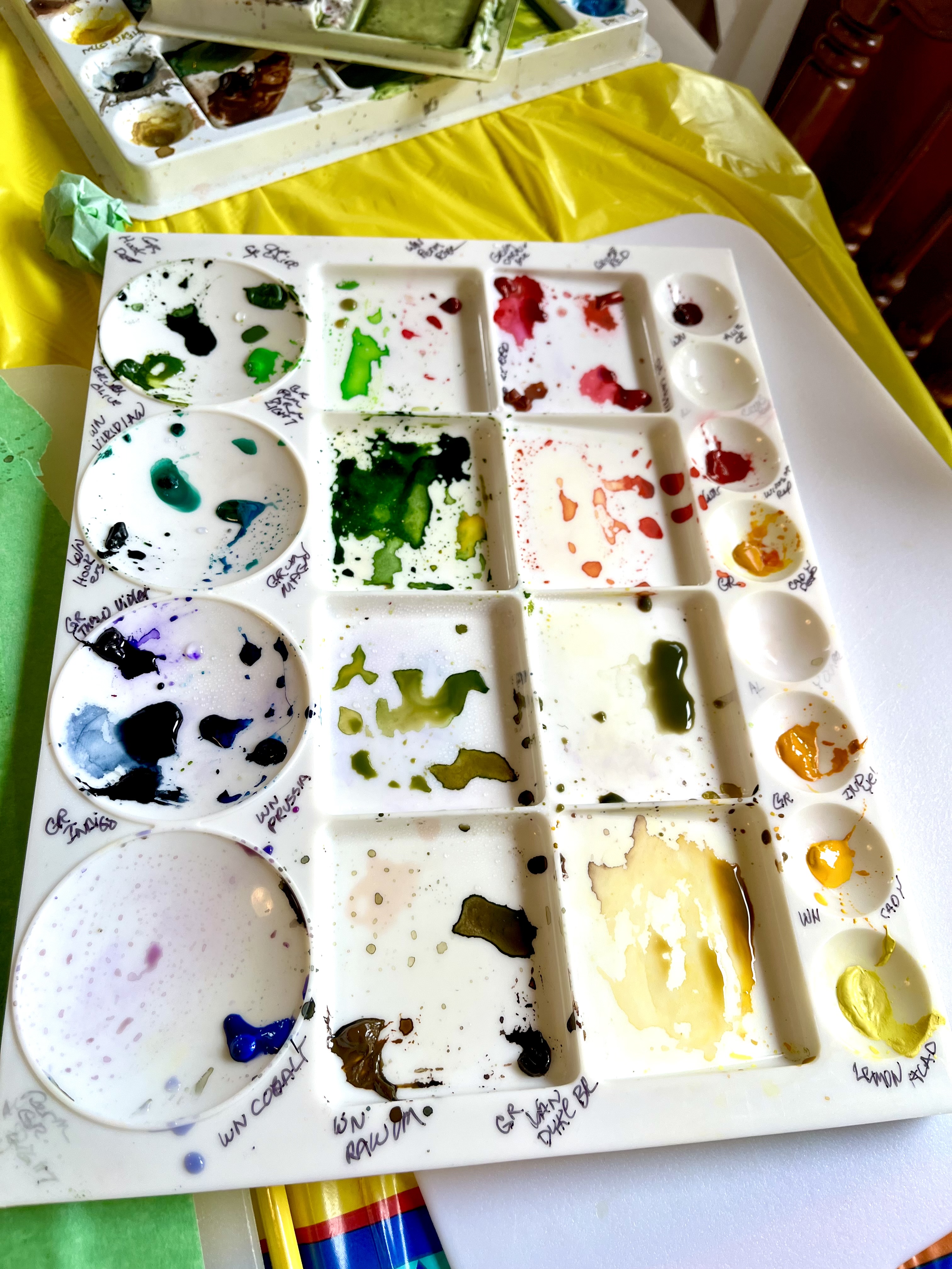
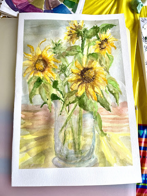
This palette is properly labeled with my second batch of paints, + Paynes Gray, with all my other colors. I need to do a color wheel for these colors also. The reason I chose these, was the lower right quadrant of Lemon Yellow, Cadmium Y Med, and Cad Y Dark, above that is Yellow Ochre---all rich colors, perfect for the sunflowers I wanted to paint.
I had these lovely sunflowers on the table for three days as I worked on the painting, doing all the mixing I could, testing on scrap paper until what I thought was the right shade. The blooms eventually began to dry up.
BRUSHES: I used a #3 round a #6 round a wash brush and a 1/2" flat. Also a spritz bottle of water to soften some of the sharper edges and keep the paper wet to make softer lines. Dry paper shows lines sharp.
Glass vases are a pain, so I tried to work on it with a light touch and letting the flowers be the main focus.
The goal here was to learn and play---trying not to worry about end results.
I used 140# Canson Water Color Paper. One side is smoother than the other, I used the rougher side.
I taped the edges of the paper down with painters tape. I used a lot of water working on the glass, you can see the bleed-out and fuzziness.
With our crazy weather, I lost my light---three times in and the painting had to sit, until the same time the next day. My vase is wide compared to the actual vase...I was working so hard on balancing the light I didn't pay attention to shape. I did sketch with a yellow watercolor pencil the circle flowers and triangle leaves and lines for the stems and winged the rest.
The taping helps to keep the paper from buckling too much. Purists wet the paper then tape it down and leave it dry overnight for a nice taut surface...but I WANTED TO PAINT....LOL.
The Sunflowers began to droop a bit...but the color!!! NUM!
I used all three Yellows and Ochre, with Burnt Sienna and a tiny wash of Paynes gray and ochre...for a dark gold.
Photographing art work is a pain...I still have to sign it and date it.
Goal accomplished.
Some Dark, Some Light, Some Dull ...Some BRIGHT!
I still could use some more darks in the leaves,
but I'm leaving it for nnow.
Maybe on the next one.
These are not the sunflowers I planted, they are a cross polination I think from last year and they are approaching 12 feet high. I think I'll have more to paint!
I'm looking forward to the next lesson on Monday, because it's great to be motivated again. If the weather continues to be poopy, I will get another one at least started, but then I have to label that palette, too.
HAVE YOU STARTED A NEW HOBBY OR PROJECT THIS SUMMER?
If you enjoyed this post please follow this blog by Blogger or FOLLOW IT which you will find in the upper right hand corner of this page.
Thanks always for visiting.
I will try and respond to every comment and answer every question.
I will be sharing at these fine Parties!
I have not been paid or reimbursed in anyway for my opinions, posts or any products shown.
Please do not use photos without linking back to this blog
without my permission.
Thank you for your cooperation,
Sandi


Your work is absolutely fantastic, Sandi. I especially love your sunflowers, which are marvelous, but I can tell your first painting was NOT your first painting -- maybe this time, but not first ever! Paynes Gray is one of my favorite colors to use. This class sounds really terrific -- covering everything. I really should do something like that because I've never had any of those classes. I'm impressed and can't wait to hear more.
ReplyDeleteHi, Jeanie...I worked in acrylics, craft painting, and some oils. Watercolors were just not my thing as I had no patience. So, I'm relearning techniques and now have the time to be patient...lol. I did a lot of ink drawings in my HS years...but gravitated to 3-Dimensional clay, ceramics, pottery in my 20's and really never looked back for years. I really do believe you are never to old to learn something new. I'm totally surprised at how much I had forgotten about color ...and relearning it has been totally awesome!
DeleteOh, and thanks so much Jeanie...and by all means take a class in color theory and mixing, so far that has been the most eye-opening for me.
DeleteWOW...love your sunflowers! You did a great job...makes me want to take art classes. Keep sharing your work !
ReplyDeleteThanks so much, Ann...by all means take an online class---and force yourself to do something often..it really helps! Sandi
Delete