Ad-Free Blog
Mather Water Color II on a new platform.
Monday I began my second round of Water Color classes on the Mather site.
Mather is a senior platform for enrichment courses that are basically free.
If you are over 55, by all means take a peek at their offerings. The classes are taught by Art Therapists, the sites are safe places to learn and interact with seniors from all over the country and a few overseas.
I was so excited to begin Water Color II...and I was all ready to work. We received a 4 page handout to print out, with the same info on supplies and basics of color theory, which is excellent reference for a beginner or advanced person. It's nice to have the basics eeked down to four pages.
The new platform, Fireworks instead of Zoom...really wasn't working well for me.
I sent info in and Mather, as well as Fireworks responded quickly. Hopefully they will have the kinks worked out, next week.

I had used a couple of these colors on my Creative Mindfulness projects and thought they were better than just student grade. I especially like the mustard gold, so I planned to use that today.
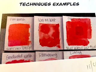
The lesson for today was on a technique. We were using was Flat wash/(wet paint on dry paper) as well as
Flat washes on top/over existing painting layers. Building colors in layers.
We were encouraged to do some swooping lines and abstract spaces, simply painted with layers of color. Flat wash / Wet on Dry...meaning a full wet brush of pigment on dry paper. and then criss-cross layering of the same application in different colors.
I chose the (adjoining colors on the color wheel) analogous colors: orange, yellow orange, and yellow. And, the (opposites on the color wheel) complementaries of Yellows and Purple. The idea being, when using these colors, how do you get shading when painting a lemon. Purple mixed with yellow produces some of the colors you see in the earthy tones..perfect for shading on a lemon.
To me, using black is mudding, and I often use Paynes Gray (a blue/brown) based color mixed for shading. So I was anxious to try these complementary shading techniques.
I'm really liking that straight line of orange over/under the purple wash...and the mustard gold on the edge. Not having a subject was freeing to just explore the lines and swaths of color.

One thing about watercolors is they always dry lighter and less intense. The yellow here, held it's strength, but I'm really tempted to continue playing with this page and bringing up the contrasts.
I'm loving all the tones here...you can see all the swipes I did in this yellow orange/mustard, purple arch I did here...I tend to work very wet with large brushes, I think I will try some line work on top of all this...again free to play
and learn the medium and how it reacts to different applications.
I hope they get all the performance kinks out of the system by next Monday, but I can't wait.
Hope this leads to some Happy Watercoloring.
If You enjoyed this post please FOLLOW IT in the upper right hand corner, to get just one email of each AD-Free post.
I will post at the following Link Parties, I hope you visit them.
All the opinions and photographs in this blog are my own, unless otherwise designated. I have not been paid or reimbursed in anyway for my opinions, posts or any products shown or anywhere I shop.
Thanks ALWAYS for visiting!
Thanks ALWAYS for visiting!
I will try and respond to every comment and answer every question. Please don't use my photos without my permission. Sandi Magle
I will try and respond to every comment and answer every question. Please don't use my photos without my permission.
Sandi Magle
| OldNewGreenRedo |


Oh wow; that sounds like such a neat and fun class.
ReplyDeleteThe first class was excellent, so far we are reviewing but instead of doing landscapes we will be working on techniques and abstract...which is freeing, because you aren't trying to produce something exact. Thanks for visiting! Sandi
DeleteI am so bad at watercoloring I'm impressed with anyone who does it well.
ReplyDeleteThese classes sound like such fun, especially getting new techniques. It's easy to fall into the old things and at least if you get some new techs and ideas, you can choose what you want to add into your own style!
ReplyDelete