AD-Free Blog
(This is a personal opinion post. I have not been reimbursed or paid for any of the products or companies I mention in this post)
NOT JUST MY OPINION on COLORS!
But, ARE WE FINALLY CRAWLING OUT OF THE GRAY CAVE?

There is nothing that dates a home/room/office more that an outdated color scheme.
Is anyone else SICK OF LIVING IN, looking at, or walking into some shade of gray, dirt gray, grungy gray, concrete gray, or even the bunny ear gray that is so soft and inviting, but after time is just blah!?
GRAY is safe...gray goes with everything, with all complexions, comes in a thousand shades of ugh...and well, every surface has been covered with it for almost a decade.
Don't get me started on white on White on WHITE! I personally need color, I need to bring the outdoors in and on a a grubby winter day, MORE WHITE isn't my palette.
I'm a COLOR person---color on patterns, patterns on color, RUGS with color, almost ALL colors. Drapes with color, drawer liners with color ---COLOR is everywhere in my home and in my yard.
According to Better Homes and Gardens, each fall, paint companies and interior design experts predict the colors that will shape our homes in the coming year. While the hues of 2022 centered around back-to-nature shades of green, 2023 will be all about self-expression.
REALLY?
Yay to BHG's CRYSTAL BALL?
IF you really want to see what will be in fashion in and home decor, check out the Pantone website which is all about color and where it will be used. Pantone makes the massive color book that paint samples come from---and their formulations. COLOR is their science as well what will be in fashion in the clothing world and home decor
PANTONE the Color GURUS of ALL FASHION and HOME DECOR
This is a great url to the science of color...take a peek later, lol.
Last Fall's forecast for 2023 was a crock of Baby Poop brown. The trend setters have to work further in advance for all the manufacturers to jump on board with the IN colors, so that there are IN towels, rugs, dishes, glassware, draperies, furniture that all go with the PERFECT IN colors.
Producing products can take as long as three years from drawing board to the store shelves, so---Pantone/BHG and all the others must work on the forecasts for at least that long.
(Which comes first the TREND or the FORECAST?)
THIS IS WHY CUSTOM anything, has always been expensive---because those who can afford to jump on the newest trend before anyone else can, so maybe Trends make the Forecasts.
How do I know this?...it's like this,
You know what it's like to have your perfect shade of blue in your bathroom and then the next season everything changes, and replacing that thick gorgeous blue towel that someone used to wipe up the mud from a dog's feet ---is ruined. This throws your whole towel rack off balance and you can't replace that same color towel only three months after you bought it.
It is fun to note that the color has been declared to have some GUTS to it now. I'm not talking about bloody RED but, some colors with some "VIM and VIGOR" is what Pantone used to declare
https://www.pantone.com/marketplace/collections/color-of-the-year
Hang on to your hats, will this really FLY!? MAGENTAVERSE!
https://www.pantone.com/color-of-the-year/2023
Wow, I love color, but what a definite break from gray/white.
UPSIDE, it will look fabulous with gray...LOL.
In fact their are four grays in name or color in the recommended in the Pantone palette of the MagentaVerse. Pantone has pronounced these the IN colors for this year. Gray Lilac and Plein Air aren't that big a step back from real grays, but you also have Gray Sand, or Agate Gray to be living with in 2023.
https://www.pantone.com/color-of-the-year/2023
Agate Gray has a definite green tone, and Pale Khaki and Fields of Rye are grayed down versions of green. Pale Dogwood is reminiscent of the 1950's (dirty)Shell pink, and Gray Sand is just plain old dirty Gold from the 1980's.
BRAVE not really---Lots of Color only ONE___
Viva Magenta
Lets take a closer look at BHG's forecast
Home Decor World by different manufacturers.
MINWAX declared Aged Barrel the stain for 2023. Pretty much not dark, not light, but shades of in between---SAFE, like a wet a stable floor, for all those wishy-washy grayed colors.
next
Krylon declared this Spanish Moss to be the color for them. Again, safe---natural---and on definitely on most pieces of outdoor furniture in the last century. I've painted over this color on my great grandmother's wicker furniture (circa 1920-30's), it is on our 25-year old garden swing. In the 1950's my mom's living room furniture was covered in green bark cloth. I used this color on my lattice displays in the 1980's for my art shows, as well as my garden bench in the 1990's.
A blend of this color has probably been their best seller for 70 years or more. Now in this shade in velvet, or chenille type fabrics, or leather it would be amazing on living room furniture.
next
Benjamin Moore's choice is Raspberry Blush----makes your mouth water, reminiscent of a fabulous Mango/Raspberry Daiquiri.
I could see this in quite a few kitchen dining areas, and definitely as accent pieces.
I call this pretty BRAVE and real COLOR!
next
I honestly had to look up this company, I had never heard of them. Apparently they are more geared to design professionals and the design trade, environmentally friendly, and high end products.
Their site is interesting, and worth a look see.
Terra Rosa to me is very 'My old GRANDMA'---old, like 1980's-90's Rose or Nursing Home icky---and tired.
But, their website had some cool ideas for REAL COLORs!
Take a look for other color ideas.
next...
Shall we swap GRAYS for BEIGES. REDEND POINT--I wasn't sure which of these colors---it was. This all has a bit of Southwest mud(90's) and sandy colors as accents. Don't get me wrong I love wood tones and dried grass shades for texture...what saves this room is are all the different textures and that fabulous
Terra Cotta clay patterned pillow.
now, next is BHG's color choice
Interesting choice, since BHG has been in the business of mass merchandising paint and home decor through several sources as well as in their magazine world.
I personally love the bright Copen Blue--- and
Canyon Ridge on walls might be a bit warm, but would make a wonderful accent color for accessories. Again, color matched with textures of beige/straw neutrals in wood and floors. What really makes it pop is the Blue accents.
Oranges and Blues are opposites on the color wheel
and such pairings are always exciting.
GROAN___NEXT...
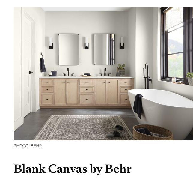
Behr picks BLANK CANVAS----um...nuf said...The black accents and fixtures save this from totally boring! Safe and uninspired.
WHY?
next
A strong Choice, Vining Ivy by GLIDDEN paired with a variety of woods and textures. Pretty much this dark/moody color would work in a palette with all the other colors chosen.
NEXT BELOW
DUTCH BOY another paint company gives us a palette.
https://trends.dutchboy.com/2023-trend-forecast/plush/
information website for your perusal
Dutch Boy came up with just about all the colors rolled into another Palette of choices called Botanic. Everything is paled a bit, or grayed down---so I guess we won't escape GRAY-ing for awhile.
MY OPINION: All these color tones have appeared before.
I uncovered 4 layers of wallpapers in our 1902 Victorian that had these colors in them, so that was represented 70 years of color history there! And, now I'm old enough I can add another 53 years to that.
This is the beauty of TRENDS
---
WHAT GOES AROUND, COMES AROUND,
As my grandmother used to say. In other words
if you wait long enough it will just be IN style again.
You can see by the various manufacturers choices for 2023,
that they relied on Pantone as the GURU of COLOR.
One thing that has changed is No actual HOME STYLE is IN.
Like our wardrobes, we are becoming accustomed to wearing comfortable clothing that makes us feel good, also in colors that enhance our own appearance.
We also like to LIVE IN-WHAT WE LIKE.
Only problem is, if YOUR palette choice isn't the NEW IN....
You are chit out of luck, or have to buy vintage to make do until YOUR COLOR becomes IN and rolls around again.
There is always VINTAGE or DIY as an alternative.
I guess I'm just VINTAGE by HEART.
OLD, NEW, GREEN, REDO
is all about living with what you LOVE,
not what others tell you
to LOVE.
Who is SHE, who goes against the MARKET???
I have over 60 college credits in ART and ART history. Multiple courses in multi-mediums after college.
I have worked in ART my entire life. I've taught HS Basic ART, HS ART2, Color Theory, Color Mixing, Craft Painting, Acrylic Painting, Faux Finishes, Oil painting, Pottery & Clay classes, Sculpture I and 2, Porcelain classes as well as extensive Floral Design and a bunch of stuff I've forgotten about in my old age.
Why this post....LOL?
I have to choose paint for my 25-year old living room.
(I use satin paints and that is why they last so long). I originally took a matte green Vase in to the store to pick the color that the walls are. We now have a tweedy-blue couch, a different rug, and hubby bought
?THREE? red chairs without consulting me.
I have to pick a color, not an American flag room, so do I go
Brave or Safe????
I have to choose, and one thing for sure it won't be GRAY!
PS dear readers, I have succumbed to white drapes, HORRORS!
Here's to the Red, White and Blue?
Dear Readers...
What has been your latest COLOR Dilemma?
If You enjoyed this post, please FOLLOW IT in the upper right hand corner, to get just one email of each AD-Free post.
I will post at the following Link Parties, I hope you visit them.
All the opinions and photographs are as found on the products websites for this post.
I have not been paid or reimbursed in anyway for my opinions, posts or any products shown or anywhere I shop.
Thanks ALWAYS for visiting!
I will try and respond to every comment and answer every question.
Thank you for your cooperation,
Sandi Magle


Those of us who live in gray climates (like Michigan in Winter) do not want gray on our walls. Or our clothes. Or anything. We see enough of it. I love color!
ReplyDeleteYEP-----nor dirty beige for when there isn't snow!! Hugs, Sandi
DeleteOh dear, then my white walls are a no no. =) But then, my home is filled with colour, glorious colour in textiles, rugs, quilts, furnishings etc etc.....so am I forgiven?? I do love the sound of your blue-tweedy couch with the three red chairs. White curtains, hey?? Well I never........ =)
ReplyDeleteLOL...yes, the white comment was for entirely white. I have a white kitchen with butcher block counters and wood floor, red or blue accents depending on the season. Not white on white on white...my major grind is the gray...lol. I've always found the way we are thrust into 'the Palette' each year, whether we want it or not, confining! Hugs, Sandi
DeleteSo colour can be outdated. I suppose I dimly realised this even if I've never felt compelled to act upon it. But hist! When we moved into the Kingston house (the one before Hereford) we were faced with a main bedroom where one wall was painted dark purple. I'm not sure whether there was ever a time when dark purple was fashionable (possibly only among people who imagined they had regal roots) but for me there was no doubt about its oppressiveness. So the wall got repainted and no doubt I cursed every paint-dripping moment.
ReplyDeleteMy attitude towards colour is encapsulated in an event when we moved to Hereford. We bought our carpets from a place which specialised in offcuts which are so much cheaper. Allowing us also to go for durability. I realised I had neglected to specify carpet for the fourth bedroom which now acts as my study. I told the supplier: "The room's pretty small - an opportunity to get rid of one of your more awkward - smaller - offcuts." He asked me about colour; I shrugged and he detected this over the phone line. He offered, "I suppose you can't go wrong with green." With a grunt I agreed. Decision made.
For self-expression I turn to prose; more infrequently, sonnets. I won't resent it if you delete me from your contacts list.
DeleteHi, Roderick. When we bought this house, the master bedroom had that brightest, hideous MAGENTA, which actually made the walls glow pink. We pulled it up within a week, and I lived on plywood splinter floors for about 3 years. Some colors are horrible, dark purples are very hard to live with...I don't blame you for covering it, and green is always safe, and comfortable. Nature colors are always a great choice. And, think of how many sonnets invoke color in their descriptions, colors add mood wherever they are used. Smiles, Sandi
I honestly don't know how I should respond to this post given I adore white and my entire house is painted in some shade of white and gray. I love blush and I can appreciate color in other people homes but my life can be really chaotic and when I finally get home I just want a calm relaxed space. The really ironic thing is that I just finished an upcoming blog post all about decorating with white 😆 That said, I hope you find exactly what you're looking for. Our homes should make us feel happy and supported the minute we walk through the front door. Hugs, CoCo
ReplyDeleteHi, Coco. You always have tons of textures and natural elements in your decorating. Everyone has to live with what is comfortable for them, and it is all about balance, There will always be plenty of whites to go around for everyone. I have one white bathroom-because it is so tiny, and my kitchen cabinets are white along with a very white ceiling..my joy is the warmth of woods floors, counters, trims and all the blue I can fit in the space, which I alternate with reds for the winter season.
DeleteI guess most of my focus on this post is how---colors are chosen for us, t then pushed and merchandised. Color is decided for us, unless of course we break the mold or can afford to go against the main market choices that are less expensive. The average consumer doesn't think about that.
As far as my living room goes, I'm like you and will be paint chipping and testing until I'm satisfied, or I'll move the rug to the family room, and get a different rug that gives me more options.
Hugs, I enjoy your blog, and you sure have been doing some big projects. Thanks for visiting! Sandi
Hi, Linda.I'm with you, neutrals are great as a blank canvas---just really hope colors liven up life a bit. Thanks for reading, and I'm all for cozy and inviting. Sandi
ReplyDeleteI always tend to go for soft colored walls for my home. That's my preference and has nothing to do with trends.
ReplyDeleteHi, Carol. I totally agree on the trends thing. Honestly I get tired of looking at blog posts right now...there are so few of us that use ANY colors...lol. Lighter walls, do set a nice backdrop. But, I have been known to throw a can of vibrancy on A single wall. Hugs, and thanks for visiting.
DeleteNice post! I will always love the neutrals. White is my jam. I've my whole life had to decorate around someone else's color choices and still feel I'm doing that. Looking forward to the day society, my existing kitchen wall color or my fave magazine tells me I can do what I want with no judgment. LOL.
ReplyDeleteHi, Cindy, I gave up magazines quite awhile ago. The Internet certainly does a more eco-friendly job of drowning us in the various 'trends'. Most of my purpose in writing the piece was to show---how we are 'drowned' in the latest trends. I personally am not in favor of any of the colors forecasted for this year..., so all those items that will appear in the marketplace won't be purchased by me. Yep, go with what you love! Thanks for stopping by, Sandi
DeleteI just happened to stumble upon your blog. I've been looking for another home and just about everyone I look at has gray walls somewhere. I've been saying for the last few years that gray will eventually go the way of avocado green and harvest gold. At least I hope so! Betty
ReplyDeleteHi, Betty. Yes, the gray has grips on everyone---I don't have gray anywhere either, I do have a white kitchen, mostly because I have so much else going on with collections and color. Gray is just oppressive at this point. Thanks for stopping by and commenting!! Sandi
DeleteThis was such a fun post - I loved your commentary on all of the colors. I, for one, am so TIRED of gray, even though not one room in my house gave in to that trend!
ReplyDeleteHi, Amy. That your home is full of colors doesn't surprise me at all...personally who wants to live in a home the color of sidewalks, LOL...when there is a whole color wheel to choose from. Hugs, and thanks for visiting and listen to my 'opinions'. Sandi
Delete