Showing posts with label painting. Show all posts

Wednesday, July 22, 2026

Mather Classes helped me Beat the HEAT!

Ad-Free Blog!  

Last WEEK, 
One thing about aging is you don't adapt very well to extreme cold or heat. And, yes, the upper Midwest is frying like the rest of the country. 

Gardening consists of turning on hoses and sprinklers and then running back into the house. 

To keep cool and busy, I've been doing a bunch of art classes. Here are some of the projects, not made for results but mostly as learning experiences. 


In my Mather Senior Art Journaling Class (I don't journal, I just take the class for new materials and techniques), this week we explored Pointillism through the works of Seurat, Van Gogh, and Monet. All of whom used dots, blobs, streaks of colors on top of colors to create shading in their works.


This was 20 minutes of making dots, ala Seurat, to make the leaf form and shadow. I used alcohol markers on simple sketchbook paper.


Alcohol markers are excellent for this technique of using dots/dashes next to each other and you get the benefit of transparency to build up a wide color range.


It looks like I used a million colors, but it is the juxtaposition of colors next to each other that makes your think...ooh what a lovely shade of green, when it is blue and yellow and even peach that makes the shading.


My trushty markers for these next projects also.


In Creative Mindfulness we worked in what you would define as slow drawing from reference photos. Again, experiencing rather than trying to achieve a finished product. Pencil underneath and colors added with markers. For me slowing down is really hard.


This one was easier, building up layers next to each other and on top of each other...lily pads...with my trusty dark blue green as a background. I did the background first and then built up the shapes....slow sketches on sketchbook paper. 
Repetitive motions are actually relaxing...and your mind eases into the process.


These are small drawings on one page in a sketchbook.


Here is something different in Paper Cutting class. Using card stock and thick foam double stick tape, I worked at a large (on 12x12 cardstock) petals of an asymmetrical flower pattern I made. I worked large, it's hard cutting small with my old hands.
 I created a pattern for the biggest petals, and then cut each smaller layer by cutting off 1/4-1/2" off the edge of the pattern. (You never know how things will work out when you make your own patterns.) Eventually it became very skimpy, I rounded the pattern off for the centers.


The separation of the petals were created by using foam stickum tape (dollar store)
and twisting the pattern pieces one quarter turn each.


This used up quite a bit of paper. The technique was from artist Jen Stark who works in multi-dimensional constructions of layers...google her work, so cool. 


Definitely a fun and a bit messy project.

Another Paper Cutting project of building up layers inspired by Jen Stark, was made by cutting from a pattern you created, then making smaller and smaller pieces...mounting them with spacers(I used cardboard bits on this one)


I also doodled ghere and there...this really needed mountin on something interesting, and I used the turquoise and yellow polka dots,  as that was what popped out among the warm colors.


The central circle bit was just glued flat, but the edge pieces were layered.

  
Very interesting effects by deconstructing  and reconstructing a simple circle.


I'm always making collage fodder, cleaning my palette, using up wet paint. The strong and dark  moody paper was perfect for the next piece...


Working on a theme of Women...and skin tones, I constructed a 'model' from different magazine images, male and female, different skin tones...plus using a multi- portraits historical page for the skirt.
This was fun, the circles were another addition as the prompt included mixint two different styles from two artists. 


The fishnet flesh was actually a male model photo in that fabric as a shirt.
I used watercolor gel pens, acrylic pens, posca-like pens, magazine pages, and lots of ink drawing and paint staining here and there...
Spent a fair amount of time on this 3+ hours assembling, not counting making the original papers. The 'dotted' white lace was used to intentionally bring out skin tones and faces.

I finally got in the garden Monday and Tuesday, we had a break in the weather, YAY~ Cucumbers had gone bonkers,

Now I have to make Overnite Dill Pickles
The best ever and so easy! 


All the opinions and photographs in

 this blog are my own unless

 identified, I have not been paid or

 reimbursed in anyway for my

 opinions, posts or any products

 shown.  


Sunday, September 14, 2025

Really USING GESSO for huge texture with Watercolor Painting.

 The class I was this month had many prompts to push yourself where you are uncomfortable. Great idea, because you never know what will move your art work forward.

Using a scaled down version of the 'dried arrangement', I used a larger piece of paper, sketched out my composition and then really slathered and dabbed the gesso on my heavy water color paper with ABANDON...really as loose as I could go and still stay within the planned sketch.


Setting up the arrangement, I left more air between the stems.


The tall stem is actually a Hollyhock stem that the buds never opened but dried on the stem. The thistle type are Sea Holly, that were quite small and also dried before fully blooming. (It was so dang hot here in JULY....ugh). I liked the graduated shading in the background lighting on the old board. 


Chinese lanterns that are normally orange upon full growth, but again dried from the heat, they had plenty of water...just wilted as shown by the curled leaves.


The dried Hydrangeas are every shade of brown, each fully grown petal curled as it dried on the plant.


I'm using artistic license to add some color to these but also giving the illusion they are dried. Here's a closeup with more air around the vase...you can see the crazy pattern, this vase is pre-1890's the best I have been able to date it.


I used watercolor pencil for sketching, and really slashed and smashed the gesso on. This time I didn't tint it...because I decided to wash the background right over all the gesso and marks with big sloppy brush strokes


First pass...of colors.
Here's my first drippy wet layer...you can see how the gesso where thick actually repels the paint. I'm again working with a blind picked limited palette, one from each of my color groupings but no blues I pulled a green by error, but kept it as a totally warm palette.


CadYellow Pale, Pthalo Yellow Green, Winsor red (a nice cross between a cool and war red), and Van Dyke Brown, I also tested washes on here.
I did a ton of mixing my colors, but only seldom used my water spritzer.


While the washes were still wet, I added some sloppy drops and wavy leaves and lines here and there. 
This is when I began dabbing off color with a paper towel and then rubbing color on with the same towel elsewhere.


Some of my lines became long pod shapes (not in the original arrangement), I don't remember the name of them, but often they were smooth brown hard pods with speckles and striping. (upper left). 


At  this angle, I think you can see the texture and buldup of the gesso as well as the watercolor layers giving the ILLUSIONS of depth through shading.

I tried to keep this area light...but all that texture eats up positive and negative space. I'm happy with not working the burrs to death, keeping them airy.


The whole painting, titled 'Fall Layers'.

I think it is still overworked, I scribbled some shadows here and there, added a few lines in colored pencil with White, med. dark Green, and Burnt Sienna. 

 
The last thing I did was take an eraser to all the raised gesso edges and also scraped/erased highlights on to the glass pitcher. I really scrubbed down that pitcher until it began to shine!

I'm happy as it is, but it's still very busy. 
I'm allowing myself one more try...sometime this week. 

Thanks for looking.

DO YOU EVER DRAW or PAINT in a SERIES? 

If You enjoyed this post please FOLLOW IT in the upper right hand corner, to get just one email of each AD-Free post.

I will post at the following Link Parties, I hope you visit them.

All the opinions and photographs in this blog are my own, unless otherwise designated. I have not been paid or reimbursed in anyway for my opinions, posts or any products shown or anywhere I shop.


Thanks ALWAYS for visiting!

I will try and respond to every comment and answer every question. Please don't use my photos without my permission.
 Sandi Magle

OldNewGreenRedo


Tuesday, April 15, 2025

Mather Mixed Media Project with Interesting results

Ad-Free Blog
One of the reasons I take these Mather classes for seniors is to loosen up, experiment and work with new materials. After 45 years stuck in clay, I really wanted to spread my artistic wings and reawaken my childhood zeal over all art mediums. Mather offers everything from poetry, writing, crafts, exercise, educational classes free for seniors over 55.

Free online classes for seniors: Mather Classes

oldnewgreenredo

Creative Mindfulness classes are based on mindfully centering yourself, then letting go, add a little art history which leads us to working with prompts based on a particular artist's art. 

This week, Ketki Fadnis was the selected artist. Ketki is a self-taught Pune, Indian artist who states, 

"Art is a healing process of body to mind and mind to soul".


How completely true. When I was going through my third knee replacement and had to wait so long...I soothed myself through watercolor painting.


Mather handout

Ketki works in different medias, abstract as well as these amazing florals where she paints an entire canvas and then blocks out a background around a design, here she chose floral flower pots. I love the movement that crosses across her shapes. 

oldnewgreenredo

We were given the choice of any type of different materials. Here I am working with my alcohol markers  on 12x12 cardstock. I really like how well the cardstock accepts any media with minimal stretching or peeling. 

Here we were encouraged to fill a page with shapes, lines swirls and doo-dads. This scribbling was very quick, maybe 3-5 minutes.

oldnewgreenredo

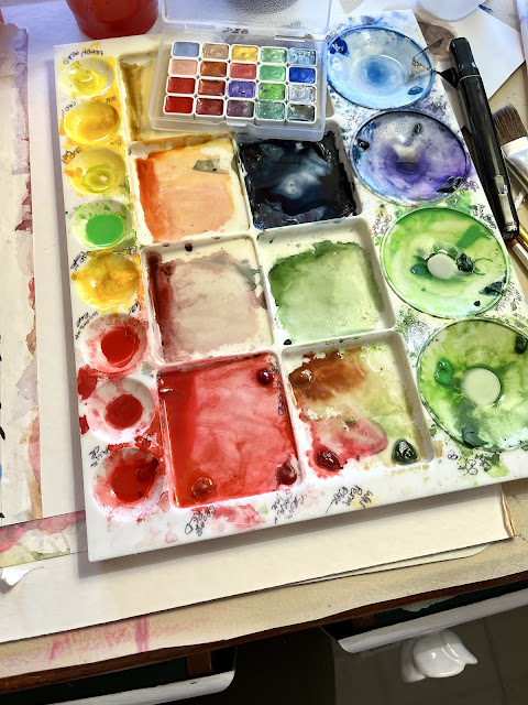
I'm trying to empty this watercolor palette so I can clean and have a fresh start, so I was limited to what was left on the palette. Thinking I would use alcohol marker as the background in black..so I went bright in choosing my colors.

oldnewgreenredo

You can see I was pretty random with the colors, but I like how the blue lines show lighter under the transparent/translucent water colors. We had to work very fast. 
Some people worked in pastels, oil pastels, crayons, charcoal, colored pencils (tedious),  or markers as well as watercolors. The recommendation was to do acrylics to do the back spaces.


oldnewgreenredo

With a white (which didn't show up) then a black charcoal pencil I outlined my vases and then leaves. I originally thought of turning the paper around and cutting out my shapes an mounting them on another page, but I followed directions and used acrylic on top of the alcohol markers and watercolors. 

Since I used quick washes...the watercolors dried pretty fast. 

It took almost 3 coats of paint on the background to get it to this stage. I may enhance or add a table or line in black..as these are floating in space, which bothers me.

If I do this technique again, I'll wait long enough for it to be completely dry before doing the background. Bleeding was minimal but persistent, so that would be a good idea. Maybe working on three or four of these at a time would work giving you time to let everything dry. 

The Apple Barrel acrylic paint from a Mather kit (rate this as kid quality only) light blue acrylic was what I had on hand without trundling downstairs in search of some better paint...the class moves so fast. I would definitely use a better paint with better coverage and a more flat finish.


How About Give this Method a Try!
and HAVE FUN!

Even great for kids on a smaller scale, maybe turn the finished Scribble that's colored over into hand cut out shapes..houses, pots, plants cars and then mount them on colored paper.  Great dexterity project for all ages.

All the opinions and photographs in this blog are my own, I have not been paid or reimbursed in anyway for my opinions, posts or any products shown.  


Wednesday, July 28, 2021

When does furniture painting become an ART

Ad-Free Blog
Last week I ventured north into Wisconsin to meet up with two cousins. Sigh, we hadn't been together for almost four years. We picked an 'out in the county' location to do some shop perusing and have lunch.
What Fun! 
One of their favorite places was the Rusty Gate in Burlington, Wisconsin.

From the moment you pull up into the parking lot, you know you are in for something special.

oldnewgreenredo

A wonderful old bed, mounted on the wall greets you.
oldnewgreenredo

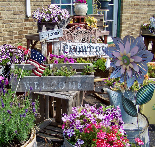
Despite the 90+ degrees, flowers in every imaginable container establish this is a 
HAPPY PLACE! 

oldnewgreenredo
I really loved the hodge-podge and riot of colors...all with VINTAGE touch.
Inside the high ceilings of the building and many full length windows fill the space with a soft light. 

oldnewgreenredo

Susie Myres, the owner greets you with a big smile a swish as she never stands still. The store is all hers, everything painted or curated by her, and it's divine.

In her own words, the Rusty Gate is Painted Furniture, Rustic Decor, Shabby Chic, Farmhouse, Steam Punk, Vintage Glam, and a bit of Industrial thrown in. 


oldnewgreenredo

A true artist, she fills the store with what she loves and it all seems to work together. 

This is where painting furniture becomes an artform.  She teaches online, and in the shop when Covid will permit, the many techniques she uses on the furniture (all of which is for sale or custom projects) displayed in the store.

oldnewgreenredo

Taking a 1920's dresser and turning it into a masterpiece for your home.


oldnewgreenredo

In this photo the piece is not so blue...but would work anywhere! 

oldnewgreenredo

Loving the shadowing on the raised details.

oldnewgreenredo

Not afraid of playing with color, this clay pink and ivory dressing table was a masterpiece. Notice the three- dimensional ivory facings on the drawers.

oldnewgreenredo

Accessories and hand-painted smalls were also for sale. Little 'This and Thats' make you want to take everything displayed home.

oldnewgreenredo

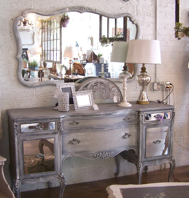
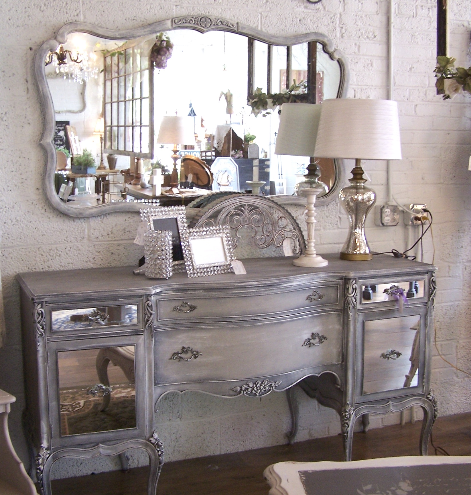
Here's the Hollywood GLAM. What makes this buffet so special are the lines, and the mirror inserts on the cabinet doors and drawers. Totally gorgeous.

oldnewgreenredo

Soft colored vintage rugs scattered across the floors add a touch of elegance and detail reflected in the mirrored cabinet door.

oldnewgreenredo

Cabinetry displays mini-vignettes of vintage and newer items, perfect for gifts.

oldnewgreenredo

Who can resist a Strawberry teapot?

The back room, used for classes was an artistic mess of activity and on going projects. Paints, stencils, stamps, and other items are available to finish your own vintage pieces.

oldnewgreenredo

Susie has such a great smile while wrapping my purchase of a large sheet stamp and a decorative molding silicone mold.

If you are interested in seeing more of Susie's artistry on furniture and other pieces you can check these out!


If You enjoyed this post please FOLLOW IT in the upper right hand corner, to get just one email of each new post


Please Join me at these fine blog parties:


Please do not use my photos without a link back to this blog without my permission.

Thank you for your cooperation, 
Sandi 
 
oldnewgreenredo