Showing posts with label Mather Senior Classes. Show all posts

Wednesday, July 29, 2026

More Art in the Heat!

 Chicagoland has been in and out of HEAT WAVES this past month. This week we finally got 3" of rain all at once...and some very severe storms throughout the midwest. We escaped that...but it was fun to just take art classes, follow my favorite artists on YouTube ....and PLAY!


I did a lot of art playing in mid July---especially making some collage papers. My video below includes :

The ART of Creating Collage papers from leftover palette paint, watercolors, markers, alcohol inks. Reviews on some papers, paints, alcohol inks and surprising techniques achieved on different drying surfaces. Happy Crafting and Painting for Collages.


\

It's not a demo, but I do describe how I got some of the effects I did, the materials I used, some tips and well some of the joyfulness of creating.

Any questions on materials, techniques and I will be happy to elaborate. Enjoy!

Below is one of the pieces I showed in the video which will actually become a painting.


This was a palette cleanse on some heavier 120# multi-media paper. I love this weight of paper because you can do anything on it, and it's not horribly expensive like watercolor paper. Biggest drawback is trying to get tape off. I'm using paper medical tape at this point...all the artists' tapes I've used are expensive and even more horrid in trying to get off.  Paper bandage tape is roughly a little heavier than washi tape...and on sale is pretty reasonable, ie...Walgreens.

But, I'm getting ahead of myself. 

My free Senior Mather Virtual classes offered a Basic Acrylics class with Emily. She's a lovely artist from Ireland who works very small and with multiple layers of thinned acrylics. Her work is beautiful and slow, but I'm a bit more energetic and impulsive. 

But, I worked on a painting the first two weeks of the class, and then have been staring at it. The rest of the class is working on different subjects and they are basically still on the background and this week beginning the foreground.

In college...I worked so fast the instructor made me work on three canvases at once in acrylic painting class...and then I muddied all of them up to total messes. 
 So, I'm trying hard to limit my time when painting, and to walk away. 

(I actually switched my major to Psychology because of Acrylic Painting and metalworking....UGH!)


Pinterest photo...no attribution? guessing the coast of England/Ireland or Scotland.

I'm using Blick/Liquitex Acrylics on gessoed watercolor paper.

My Palette is Ultramarine Blue, Primary Red, Cadmium yellow Lt., Raw Umber and Titanium White.


This was my second session on this painting, the ridges you see are from the gesso that was applied haphazardly on heavy watercolor paper for another project. Since this was a class I wasn't interested in a finished product, but the process.

I wasn't trying to duplicate the photo, but use it as a stepping off point. 

I thought this stage was a bit undefined and lifeless.

And something I do now, when I'm not happy with a project is take photos and make them black and white to see the values (the intensity) of my colors in shades of gray.


The lower photo is the original photo, now in black and white. 

The foreground bothered me and also the land mass sticking out into the sea. I needed to darken or define those areas a bit...and fix the foreground...maybe?


At the top, bits of red are suggestions...and also a little in the sand. I darkened shadows under the trees with all the palette colors mixed together, but white. 
You also can really see the gesso marks here...how they are going the wrong way for this composition. 

But then again, this is a practice piece.


While the village is pretty undefined and here you can see the gesso marks again, I really darkened the foreground and avoided details...as for me, the subject is the cozy village and the water.


Yesterday, I scribbled a bit here and there with a watercolor pencil in black(horrors--black). I can add some water for shading and either erase it by wiping off or...spray with a fixative. Then I can seal the painting when I decide it's done.

Is this finished? I don't know...but it has been a great learning experience. It's still taped on the easel, so we will see. 

Moving on....


Back to that palette paper cleanse in the video. I decided to do an edited version of the photo, this time.


Here again is my subject photo from Pinterest but....I loved the colors and tried to stay true to that with another go and even looser attempt at the village. 


My Acrylic colors used above and below are: Yellow Ochre, Cadmium Yellow Lt, Ultramarine Blue, Raw Umber, white and no red in this project. I enjoy working with a limited color palette, and it forces me to mix colors...so the greens are mixed as are the sandy colors and the grays. I went for the deeper shades and the brightest shades first over the existing base.


The above is my first run...blocking out the shapes and basic colors. I used a 12 flat brush..yes, like 3/4" wide on this paper.
This is when it is wet and you walk away.


A second go...I like the looseness of this one, the simplicity...is it done???? 
I have all these blank canvases downstairs, I think I will try this subject matter one more time and see what happens on a 24"x36" maybe? 

What do you think, are they FINISHED???


All the opinions and photographs in this blog are my own unless identified, I have not been paid or reimbursed in anyway for my opinions, posts or any products shown.  


OldNewGreenRedo

Wednesday, July 22, 2026

Mather Classes helped me Beat the HEAT!

Ad-Free Blog!  

Last WEEK, 
One thing about aging is you don't adapt very well to extreme cold or heat. And, yes, the upper Midwest is frying like the rest of the country. 

Gardening consists of turning on hoses and sprinklers and then running back into the house. 

To keep cool and busy, I've been doing a bunch of art classes. Here are some of the projects, not made for results but mostly as learning experiences. 


In my Mather Senior Art Journaling Class (I don't journal, I just take the class for new materials and techniques), this week we explored Pointillism through the works of Seurat, Van Gogh, and Monet. All of whom used dots, blobs, streaks of colors on top of colors to create shading in their works.


This was 20 minutes of making dots, ala Seurat, to make the leaf form and shadow. I used alcohol markers on simple sketchbook paper.


Alcohol markers are excellent for this technique of using dots/dashes next to each other and you get the benefit of transparency to build up a wide color range.


It looks like I used a million colors, but it is the juxtaposition of colors next to each other that makes your think...ooh what a lovely shade of green, when it is blue and yellow and even peach that makes the shading.


My trushty markers for these next projects also.


In Creative Mindfulness we worked in what you would define as slow drawing from reference photos. Again, experiencing rather than trying to achieve a finished product. Pencil underneath and colors added with markers. For me slowing down is really hard.


This one was easier, building up layers next to each other and on top of each other...lily pads...with my trusty dark blue green as a background. I did the background first and then built up the shapes....slow sketches on sketchbook paper. 
Repetitive motions are actually relaxing...and your mind eases into the process.


These are small drawings on one page in a sketchbook.


Here is something different in Paper Cutting class. Using card stock and thick foam double stick tape, I worked at a large (on 12x12 cardstock) petals of an asymmetrical flower pattern I made. I worked large, it's hard cutting small with my old hands.
 I created a pattern for the biggest petals, and then cut each smaller layer by cutting off 1/4-1/2" off the edge of the pattern. (You never know how things will work out when you make your own patterns.) Eventually it became very skimpy, I rounded the pattern off for the centers.


The separation of the petals were created by using foam stickum tape (dollar store)
and twisting the pattern pieces one quarter turn each.


This used up quite a bit of paper. The technique was from artist Jen Stark who works in multi-dimensional constructions of layers...google her work, so cool. 


Definitely a fun and a bit messy project.

Another Paper Cutting project of building up layers inspired by Jen Stark, was made by cutting from a pattern you created, then making smaller and smaller pieces...mounting them with spacers(I used cardboard bits on this one)


I also doodled ghere and there...this really needed mountin on something interesting, and I used the turquoise and yellow polka dots,  as that was what popped out among the warm colors.


The central circle bit was just glued flat, but the edge pieces were layered.

  
Very interesting effects by deconstructing  and reconstructing a simple circle.


I'm always making collage fodder, cleaning my palette, using up wet paint. The strong and dark  moody paper was perfect for the next piece...


Working on a theme of Women...and skin tones, I constructed a 'model' from different magazine images, male and female, different skin tones...plus using a multi- portraits historical page for the skirt.
This was fun, the circles were another addition as the prompt included mixint two different styles from two artists. 


The fishnet flesh was actually a male model photo in that fabric as a shirt.
I used watercolor gel pens, acrylic pens, posca-like pens, magazine pages, and lots of ink drawing and paint staining here and there...
Spent a fair amount of time on this 3+ hours assembling, not counting making the original papers. The 'dotted' white lace was used to intentionally bring out skin tones and faces.

I finally got in the garden Monday and Tuesday, we had a break in the weather, YAY~ Cucumbers had gone bonkers,

Now I have to make Overnite Dill Pickles
The best ever and so easy! 


All the opinions and photographs in

 this blog are my own unless

 identified, I have not been paid or

 reimbursed in anyway for my

 opinions, posts or any products

 shown.  


Tuesday, October 14, 2025

Inspired by Leaves, some kind of Mandala

 Ad-Free Blog

My Creative Mindfulness Class with Casey on Mather was on Monday. The entire month of October is themed on Leaves. 
This was a fun project, to cut out leaves from decorative papers (I used a bit of everything) and create a Fall Mandala. Well I chose Fall since the tones of my hand-painted papers were in golds, browns, and greens. I threw in some orange Cardstock for a solid and used a cardstock brown background

You can see the paper cutouts to the side and some of the papers I used.

oldnewgreenredo

Simple materials and open instructions always makes a project fun. We were encouraged to add decorative elements. I still may work some more on the background to make it darker.

oldnewgreenredo

These are the markers I've used so far. First time using my Artists Loft Acrylic Markers from Michaels. Nice saturated color and dried quickly, tip is a bit mooshy. 
My Alcohol markers and some metallic markers....and a trusty Sharpie. I really need to buy a couple of super wide ones.

oldnewgreenredo

An interesting direction was to fold and mount the leaves for a 3D effect. 
Since I chose some patterned papers, I did limited designs on those.


oldnewgreenredo

This class was only an hour but I puttered for another 40 minutes after class...still thinking about darkening the background.

Mather FREE Senior Classes INFO, HERE!

oldnewgreenredo

I cheated a bit and measured out a circle underneath all this to maintain a good balance with my pieces. And I think that was a good idea. I had planned to use not necessarily balanced pieces...so at least having them in correct alignment helped ot keep this very measured. Again, I ended off the paper, so displaying this will require some sort of border or expansion of this piece.

Great idea for kids and just for fun. I think I will use this as a display piece for the season.

What sort of Art
 have you been doing for FALL?

I will post at the following Link Parties, I hope you visit them.


All the opinions and photographs in this blog are my own, unless otherwise designated. I have not been paid or reimbursed in anyway for my opinions, posts or any products shown or anywhere I shop.


Thanks ALWAYS for visiting!

I will try and respond to every comment and answer every question. Please don't use my photos without my permission.
 Sandi Magle

OldNewGreenRedo


Saturday, June 14, 2025

Creative Mindfulness with Casey: Peru Inspirations.

Ad-Free Post

We have had two Creative Mindfulness Mather classes this month with Casey with prompts from Peruvian Art.

Mather Classes
Mather classes


Casey took a trip to Peru in May...and came back so excited about all the arts, fabrics, scenery of the country which she will be sharing for the month of June. 


Mather classes

Our first class on Peru was Rainbow Mountain or Mt. Cuzco, Peru. Yes, this is a real place. There are a ton of photos on this location, and it seems the colors are different certain times of the year. The shot on the right is an actual photo...and you can see the tiny people at the base of the red part, walking. Left is Casey's take on the scene.

Yes, the hues can be very bright, depending on the angle of the sun and time of year. 
Here is a clip of a Pinterest photo...

Pinterest

I love the jacket that has all the colors and variations in it similar to the hills. The colors occur because of all the minerals in the different layers that were upheaveled when Teutonic plates converged and created the Andes mountains.

oldnewgreenredo
Anyway, our prompt was to draw our own mountain, and hills, background and sky and fill in each layer with whatever color we wanted.

oldnewgreenredo

Creative Mindfulness is all about getting lost in your work, and filling in all the stripes of my mountain with pencils was very soothing. I might try a water color in the future,  I  increased the width of the lines in the foreground, to give an idea of detail and closer proximity, and used more faded colors in the background hills. I scribbled the sky and clouds without any details.

oldnewgreenredo

I used black Sharpies, pencil, eraser, and colored pencils, and later watercolor washes.

oldnewgreenredo

I do love becoming lost in a project...it's the journey not the destination.

The next week, we had something entirely different.
HANDWOVEN FABRICS. 

Here I used a few pencils, markers, and some water color washes, and I chose to tape off some straight lines...because I simply can't make a long straight line....LOL.

oldnewgreenredo

The patterns are from weavings in clothing and rugs. Peru is known for it's Alpacas and Lamas and some sheep, and the gorgeous uses of natural dyes and colors.


oldnewgreenredo

We were encouraged to make lines, similar to the ones on the left example.

mather classes

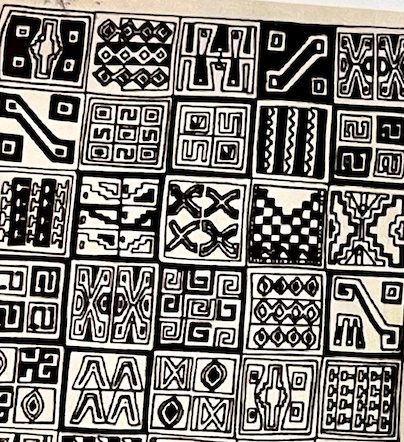
A black and white breakdown of all the images in the block patterns was provided on a worksheet. 
Mather handout

Enlargement of some of the motifs used in the fabric example. These showed the simplicity of the images. I chose to use some for my blocks, as well as horizontal dividing bars to break up the designs. Again this was a starting point for our own take on the patterns.

oldnewgreenredo

I used a light sticky tape for my 3/8" lines...way easier to do than drawing long straight lines and protecting the surface from my screwups while adding my designs.
 I didn't remove the tape until all the drawings and coloring with pencils was done. Once removed, I washed all the areas with earth-toned subdued watercolor washes.

oldnewgreenredo

The muted washes filled in all the blank spaces and didn't overtake any of the pencil sketching. I did add the shading on the stripes afterward with pencils as they were too blank for the rest of the design. I criss-crossed my brushstrokes to give the idea of warp and weft. Here you can see where I removed my outside tape and then just had to add one more swoop of the brush.

oldnewgreenredo

The larger images on the right and left edges were what I imagined would be on a rug. 

oldnewgreenredo

I took some of the motifs from the right and enlarged them for the outside left, and similar for the right side. Again, experimenting with my take on the subject. 

Mather Classes

I really love these Mather Classes for the different artists/artforms we explore each week. I really enjoyed both of these artforms and the information on Peruvian art.

Again, Mather Senior Classes are free on Zoom for 
Seniors over 55....and are available, HERE. 
I appreciate the interaction and being able to ask questions, share on a community facebook page...and most important LEARN new techniques and materials, in a safe and congenial space. The instructors I've had,  are all Art Therapists and excellent.

Have you ever done 
Artwork from a vacation trip? 


All the opinions and photographs in this blog are my own unless identified, I have not been paid or reimbursed in anyway for my opinions, posts or any products shown.