Showing posts with label limited color palette. Show all posts

Wednesday, July 29, 2026

More Art in the Heat!

 Chicagoland has been in and out of HEAT WAVES this past month. This week we finally got 3" of rain all at once...and some very severe storms throughout the midwest. We escaped that...but it was fun to just take art classes, follow my favorite artists on YouTube ....and PLAY!


I did a lot of art playing in mid July---especially making some collage papers. My video below includes :

The ART of Creating Collage papers from leftover palette paint, watercolors, markers, alcohol inks. Reviews on some papers, paints, alcohol inks and surprising techniques achieved on different drying surfaces. Happy Crafting and Painting for Collages.


\

It's not a demo, but I do describe how I got some of the effects I did, the materials I used, some tips and well some of the joyfulness of creating.

Any questions on materials, techniques and I will be happy to elaborate. Enjoy!

Below is one of the pieces I showed in the video which will actually become a painting.


This was a palette cleanse on some heavier 120# multi-media paper. I love this weight of paper because you can do anything on it, and it's not horribly expensive like watercolor paper. Biggest drawback is trying to get tape off. I'm using paper medical tape at this point...all the artists' tapes I've used are expensive and even more horrid in trying to get off.  Paper bandage tape is roughly a little heavier than washi tape...and on sale is pretty reasonable, ie...Walgreens.

But, I'm getting ahead of myself. 

My free Senior Mather Virtual classes offered a Basic Acrylics class with Emily. She's a lovely artist from Ireland who works very small and with multiple layers of thinned acrylics. Her work is beautiful and slow, but I'm a bit more energetic and impulsive. 

But, I worked on a painting the first two weeks of the class, and then have been staring at it. The rest of the class is working on different subjects and they are basically still on the background and this week beginning the foreground.

In college...I worked so fast the instructor made me work on three canvases at once in acrylic painting class...and then I muddied all of them up to total messes. 
 So, I'm trying hard to limit my time when painting, and to walk away. 

(I actually switched my major to Psychology because of Acrylic Painting and metalworking....UGH!)


Pinterest photo...no attribution? guessing the coast of England/Ireland or Scotland.

I'm using Blick/Liquitex Acrylics on gessoed watercolor paper.

My Palette is Ultramarine Blue, Primary Red, Cadmium yellow Lt., Raw Umber and Titanium White.


This was my second session on this painting, the ridges you see are from the gesso that was applied haphazardly on heavy watercolor paper for another project. Since this was a class I wasn't interested in a finished product, but the process.

I wasn't trying to duplicate the photo, but use it as a stepping off point. 

I thought this stage was a bit undefined and lifeless.

And something I do now, when I'm not happy with a project is take photos and make them black and white to see the values (the intensity) of my colors in shades of gray.


The lower photo is the original photo, now in black and white. 

The foreground bothered me and also the land mass sticking out into the sea. I needed to darken or define those areas a bit...and fix the foreground...maybe?


At the top, bits of red are suggestions...and also a little in the sand. I darkened shadows under the trees with all the palette colors mixed together, but white. 
You also can really see the gesso marks here...how they are going the wrong way for this composition. 

But then again, this is a practice piece.


While the village is pretty undefined and here you can see the gesso marks again, I really darkened the foreground and avoided details...as for me, the subject is the cozy village and the water.


Yesterday, I scribbled a bit here and there with a watercolor pencil in black(horrors--black). I can add some water for shading and either erase it by wiping off or...spray with a fixative. Then I can seal the painting when I decide it's done.

Is this finished? I don't know...but it has been a great learning experience. It's still taped on the easel, so we will see. 

Moving on....


Back to that palette paper cleanse in the video. I decided to do an edited version of the photo, this time.


Here again is my subject photo from Pinterest but....I loved the colors and tried to stay true to that with another go and even looser attempt at the village. 


My Acrylic colors used above and below are: Yellow Ochre, Cadmium Yellow Lt, Ultramarine Blue, Raw Umber, white and no red in this project. I enjoy working with a limited color palette, and it forces me to mix colors...so the greens are mixed as are the sandy colors and the grays. I went for the deeper shades and the brightest shades first over the existing base.


The above is my first run...blocking out the shapes and basic colors. I used a 12 flat brush..yes, like 3/4" wide on this paper.
This is when it is wet and you walk away.


A second go...I like the looseness of this one, the simplicity...is it done???? 
I have all these blank canvases downstairs, I think I will try this subject matter one more time and see what happens on a 24"x36" maybe? 

What do you think, are they FINISHED???


All the opinions and photographs in this blog are my own unless identified, I have not been paid or reimbursed in anyway for my opinions, posts or any products shown.  


OldNewGreenRedo

Thursday, September 11, 2025

Using Gesso as a 'Painting' medium or base.

 Ad-Free Blog

While gardening and cleaning out flower beds, I was just getting rid of the really dead stuff, I collected some interesting bits and pieces.

Three very brown dried Hydrangea blossoms

A Long dried stem of HollyHock. The seeds weren't even exposed as blossoms and had dried on the stem un- opened.

and 2 branches of Chinese lanterns were dried green before they even turned orange. I planted 1 package maybe 4 years ago and they show up everywhere as a weed now.


I plopped them in my thick weird glass pitcher (squared fence picket pressed glass). 

The pitcher is before 1891 and made by King Son Glass Co. in Pittsburgh, Pa. It's weird and chunky, thick but that wonderful slightly blued/green/clear glass of that period.


The pitcher is very heavy, but the dark hydrangeas...really visually weigh a bit themselves.

I chose a large sheet of Water Color paper and used the back rougher side.


In an attempt to loosen up---I scribbled with yellow, turquoise and gray(silvery) watercolor gel sticks. I love using these as you can erase your lines simply by painting water on them and the colors mix well with regular wc. 

The gray mushy stuff is textured gesso which I lightly tinted with gray and smeared on with a serrated plastic carry-out knife. I wanted to get some texture going on this piece...all the petals being so tactile. I even dabbed gesso on with my finger tip to give the feeling of round petals.


Closeup on the pitcher and thick glass and a stray lantern on the table. 


My limited palette was made from Cadmium Yellow Med, Carmine, Ultra Purple, Viridian, and Van Dyke Brown--a rich deep almost black brown which I used for the dried up leaves and mixed with so many of the washed out earthy colors. All the colors on the sheet were mixed from those 5 colors.


I didn't paint everything brown and went more for imagined light source on slightly green foliage and flowers. 

It's very busy, but I enjoyed working on top of the gel sticks, and the slight shimmer of the gray gel stick was perfect for the glass. I painted out 99% of the white paper again, only leaving the glass void of some paint.

I named this 'Last Bouquet', in honor of the end of summer. 

I think I will try the same vase and flowers on larger paper with more 'AIR' around it and even looser...maybe with different colors. I guess we will see. I'll also use gesso more and maybe with more fingers!!

Happy Painting!

If You enjoyed this post please FOLLOW IT in the upper right hand corner, to get just one email of each AD-Free post.

I will post at the following Link Parties, I hope you visit them.

All the opinions and photographs in this blog are my own, unless otherwise designated. I have not been paid or reimbursed in anyway for my opinions, posts or any products shown or anywhere I shop.


Thanks ALWAYS for visiting!

I will try and respond to every comment and answer every question. Please don't use my photos without my permission.
 Sandi Magle

OldNewGreenRedo


Friday, May 30, 2025

Sketchbook BingeFest: Color/Pattern with Faith Evan Sills

Ad-Free Blog
Sketchbook BingeFest 

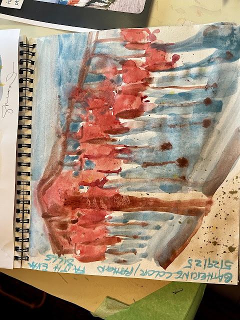
Gathering Color and Pattern

Wow, these projects are flying. I had a hard time deciding to pick an image for this color pattern project. Faith led us through looking at a photo---any sort, she used a muted home decor photo to create a page of patterns and mixed colors suggested by the photo. And adding designs reminiscent of textures from the photo.

BUT, 
I still have these three palettes I'm trying to use up of three basic yellow, blue, crimson and some brown up.

oldnewgreenredo

Going through my mail, I saw this great photo from a blog I follow on dolls, Antique Lilac..Mary Boer shared some vacation photos...and my favorite was this one of fishing bouys along a dock here on her blog:
She does fabulous handmade dolls and scenes along with detailed settings. Her dolls were on the seashore plus she added a few maritime photos.

Mary Boer Photo

HER PHOTO: definitely had color and pattern for inspiration.  I choose three bright rounds brushes and one flat brush and planned on working from my limited palettes only.

oldnewgreenredo

As suggested, I broke down the patterns and shapes into basic color swatches. Working in watercolors in the sketchbook. The paper is very tight and smooth with small speckles in it, and holds up fairly well with water for a thin paper.

The blues all began with Cerulean and then adding Crimson, a bit of yellow or Burnt Umber to change the depth or tint. Grays were combination of Crimson, Yellow, Cerulean.

This was very quick....maybe 12-15 minutes.


oldnewgreenredo
  
Turning this on it's side you can lose the actual imagery and it becomes more pattern. I worked quite wet, since we were speeding along and the watercolors definitely bled into each other. 

I also drew on a second page within a defined rectangle. Worked from a quick sketch and painted in the background before and around the bouys. Here I am going for a bit more realism, because I just really like the repetition of the image.

oldnewgreenredo


Keeping in mind this is sketchbook and not a finished project I went for some shading and again layers of color. Lesson...breaking down the idea to simple shapes and forms. I managed to keep the bright contrast here with the white on the bouys.]
This was equally quick, only planned out by doing the backgrounds first.

oldnewgreenredo

 Special thanks to Faith. I may try her approach again when contemplating a large piece, making lines and shapes of colors to match a desired project. Limiting a palette is always interesting...and these pieces with only the four colors are definitely a challenge. 

Everyday a new project,

 I wonder what tomorrow will bring!


All the opinions and photographs in this blog are my own unless identified, I have not been paid or reimbursed in anyway for my opinions, posts or any products shown.