Saturday, August 16, 2025

Collage: Through the Window with Paper Explorations Composition

I'm way behind on posting these. This was a class two weeks ago...only prompt was to use cut papers with a Through the Window theme in my Mather for seniors class.

Honestly 40 or so minutes isn't enough to do a work start to finish. I did go through my magazine page ahead of time and pulled what I thought would be a lovely vacation villa with a view...but also to concentrate on the inside instead of outside the window.

oldnewgreenredo

The angle of the camera made this forced perspective. Nice outside view somewhere with lovely water in the window.

oldnewgreenredo

While I had a stack of pages selected, I didn't have a cohesive idea. But, class started and so I began
with the window on the peach paper and then added a darker blue floor. One of the scraps I had was an advertisement for a busy rug, which I cut all apart and reassembled on the floor. 

We were encouraged to add a three-dimensional element. I planned a window/mirror made from a circle.

oldnewgreenredo
I used an image and reinforced the little doors with card stock. The round element helped to add some softness the angular elements in the page so far.

oldnewgreenredo

Inside the round shutters is a fisted woman from an art magazine, a reflection perhaps or a painting. A surprise for a peaceful setting.

oldnewgreenredo

The table and chairs came from a decor magazine. I actually used an exacto-knife to cut in between the legs, etc.

I built a little briefcase box that opens and closes to sit on the floor. 

oldnewgreenredo

Surprise element: smiling lips under the lid.

I added a few plants and a pot with flowers...all from magazine cuttings, bits and pieces.

oldnewgreenredo

I found the tiger which I imagined to be a stuffed toy, playing with a ball. When you are working so fast, you are actually unaware of composition details. 
But let's look at my overall composition.

Notice the triangular balances of colors: Red on the vase base on the left, the flower pot on the right, and the red in the window on the upper right.

Same with the Yellow ball/tiger on the lower left, the flowers on the right, and the yellow elements on the doors of the circle image.

The stronger balance of heavy blue on the bottom, medium blue of the window scene, capped with the lighter border on the ceiling. Not triangular, but a grounding of sorts for the whole composition. The viewer knows where he/she is standing on a solid floor.

None of this was conscious...but actually a good way to design an artwork.

Even the little dashes of white are balanced, the rug fringe, the shutters, and the white around the table area.

All these composition elements keep your eyes moving around but staying on the page in the room.

oldnewgreenredo

I used little bits of green here and there...the leaves on this potted palm are also three-dimensional, giving the page three-three dimensional elements, also forming a triangle.

Whether you are working with pieced elements in a collage, color elements in a painting, or the weight/shades of different lines in a drawing, it is the composition that determines if a work is interesting, exciting, or peaceful.

Comparing Composition Elements

Triangular elements keep your eyes on the page, drawing you in. Often called the Golden Triangle of composition. This can be done with color, line, or shapes.

Horizontal linear elements can give the feeling of stability or solidarity such as a road anchoring the subject on the work, or can also be peaceful and calm such as water or a soft horizon. 

Vertical linear elements suggest growth, strength, and stability; plants, forests, walls, or  buildings

Diagonal linear elements are energetic, but an excess of criss-crossed angular elements will insert chaos.

Here's a powerful example of all the above.

wikipedia/Guernica by Picasso


Without color...Picasso managed to use all the different types of composition in this huge anti-war oil painting titled, Guernica depicting the bombing of a Spanish town in Basque in 1937.

Notice the large Triangular composition that keeps you in the center of the work. Then the other triangles are broken up into individual subjects: the Mother on the left with baby, the man on the lower left arms spread out and body forming a triangle, the horse head with leg, the wind head to the right center, the running figure across the lower right, another figure reaching up and ending in a triangle point below.

What does this do?

The entire composition is triangular and chaotic, violent, expressed by the many overlapping triangles. The only element that isn't in a triangle is the all-seeing eye/lightbulb, Picasso's eye of the world watching.

The Verticals such as the fists and arms raised represent the strength of the people. 

The Horizontal lines of arms/legs the surrender or still finality of death. 

 In black and white, Picasso still expressed the horrors and deaths of war. 
Wow, sorry this just got dark.

How about a lovely example of triangular composition?

Wikipedia

Leonardo Da Vinci's Mona Lisa, her entire figure is a tight triangle, the other linear elements are all horizontal: water, horizon, the table her hands are resting on. The whole composition is peaceful.

Why the Mona Lisa is considered such a great work? Perhaps because of the small triangular smile/secret which you can't help but focus on, and her peaceful hands. The only diagonal lines are in her harmless clothing.

Composition should always interesting. 
I hope this helps a bit when you are doing your projects.

What is your favorite type of Composition
 to use in your artwork?
(Apparently mine
 is triangular
?)

All the opinions and photographs in this blog are my own unless identified, I have not been paid or reimbursed in anyway for my opinions, posts or any products shown.  

Thursday, August 14, 2025

Color Washed Shapes and Designs

Ad-Free Blog

oldnewgreenredo

This was fun...simple washed watercolor blobs/circles. (I can't make a circle, well rarely) and then do scribbles on them. It was fun trying to do something different in each one. First one ended up being the new planet? they think they have found with multiple rings, the third one a jellyfish or a cabbage? 


oldnewgreenredo

Blobs are so organic... I think I see some shells, eggs, or/and rocks/geodes.

oldnewgreenredo

Experimentation is always good for stretching your skills and your imagination.
Play is good for your soul!

oldnewgreenredo

The black and gray one used Pebeo resist pen...great way to test new art supplies.

oldnewgreenredo

The shimmer looking lines are from metallic pens..with brush or line tip...I like that they are basically subtle in color and sheen.

oldnewgreenredo
My poor old watercolor palette. I'm too cheap to wash it off, and just keep reusing colors over and over...altered or pure.

oldnewgreenredo

Simple materials, paper, water colors, two brushes, two markers and the metallic pens for the jewelry. I may do this again with different shapes. 

WHAT Do YOU make of your BLOBS! ???

All the opinions and photographs in this blog are my own unless identified, I have not been paid or reimbursed in anyway for my opinions, posts or any products shown.  


Monday, July 28, 2025

Free Online Class with Instructor Joy Ting.

Ad-Free Blog 

I'm wishing to loosen up a bit in my approach to Water Colors or mixed media. 

 I did a class with Joy Ting. Seems she runs a freebie class every month or so. I was interested in the floral prompt photo, not able to share which was just a huge smattering of flowers, layers and layers of fresh flowers. So many, you couldn't possibly paint them all on a small 11 x 14.  I used a heavy multi-media paper, because I knew we were going to be doing a lot of different things.

oldnewgreenredo
Stage 1

I should have taken photos as we went along, but working live so fast it is impossible...basically I got the floral shapes done in class and no background or leaves. 

The flower shapes were very loose with sloppy wet water colors. Then we scribbled/marked up the flower shapes (I used some water-based Gelato sticks in bright colors.) You can see the blotchy colors on the rough texture of the paper. 
It was so loose, it literally looked like blotches. 

After class I added watercolor greens in the background. I personally am not fond of white paper, unless the subject matter (snow, clouds, houses, flowers, etc.) are white. This was the first day.

oldnewgreenred
Stage 2
Okay, I wasn't happy with the definition of Day 1. So I dragged out my colored pencils, alcohol markers and went to work. 
First thing I did was take the Gelato marks with water, and then alcohol to marry the markers and the Gelato marks. I tried to blend them into their surroundings, and then I began darkening the background and shadows with markers and ordinary colored pencils.

oldnewgreenredo
Stage 2

I just didn't want blotch flowers, but blotches then began to be Marigolds, Zinnia Stock, Canterbury Bells, leaves of Coleus, Bachelor buttons, Morning Glories, and a few I'm not sure what they are. 

oldnewgreenredo

Stage 3

Slowly the jumble of shapes began to blossom and the background retreated back. I softened lots of edges with alcohol on a brush, but still leaving some grainy bits of the Gelato sticks (the flowers on the bottom) for texture.

oldnewgreenredo
Stage 3
I chose to not have access to the prompt photo after class, so I let the shapes take me to flowers I knew. 

oldnewgreenredo
Stage 3

Even a stem of Lupine grew from some blue blotches.  The pink/blue flower to the right was layered with mauve marker over the scattering of blue water color and Turquoise Gelato stick-nummy subdued lavenders.

oldnewgreenredo
Stage 3

Morning Glories are beautiful and easy to spot, but the gold cluster on the left which was in the photo, I can't seem to identify the flower (with tube bells with speckles.)  
Backgrounds: I didn't use any black, it just seems so. Layers of green water colors with added dark browns and dark green markers deepened the background.
Light and dark shadings on flowers/foliage were usually done with colored pencils or thin marker tips. 

oldnewgreenredo

I'm not totally pleased with the result, but I learned so much from this process.

Conclusion: Try as I might, I'm not a super free painter...I like some reality added to blotches. I will try to  continue and loosen up. I'm also thinking I'm trending toward multi-media. And, really liking the alcohol markers for their control and intensity. I really enjoy the transparent layering of the markers over the water colors or other media...intensifying here and there, subduing and defining elsewhere.

oldnewgreenredo

PS my Faber Castell Water-based Gelatos sticks  also break down with alcohol on a brush, making them very versatile. I had picked up this set on deep discount. And I'm considering watching for a deal on another set. I had considered oil pastels, but now I think the water/alcohol dissolvable will be better for me.
Any questions, I will try and answer!

What's on your Art Desk 
or in your Sketchbook, 
this week?

All the opinions and photographs in this blog are my own unless identified, I have not been paid or reimbursed in anyway for my opinions, posts or any products shown.  


Mather Creative Mindfulness: Lake Shore Organic Shapes

Mather Creative Mindfulness:Lakeshore Organic Shapes.

I totally love my Monday late afternoon class with Casey. The Mather classes are geared towards seniors, but honestly how fun the prompts are and free spirited.

This week the guide was to just work with organic shapes. I had been thinking so much of the beach in my hometown on Lake Michigan. I'll be visiting later this week and I will definitely stop at the lakeshore and beach.

We were encouraged to begin with large free lines and then some organic shapes. 
For me the idea of water and sand, seaweed and critters in the lake. Lake Michigan is full of rocks, fossils, polished glass, bits, small shells and birds picking the shoreline

oldnewgreenredo

From the outlines we were encouraged to make concentric lines following our main shapes. The example was in black and white and then red. Well, you know how I love color by now....so I think I used at least a dozen. 


oldnewgreenredo

I think I like it this way.....Definitely a fun exercise. Sometimes scribbling is just a wonderful way to pass an hour or so. 


My lines are a bit shakey, but I love the layering of the colors of my alcohol markers from 5-Below...you can't beat the price. Every time I use them I discover a new combination of colors and marks.
Hope you enjoy my 'Lakeshore Organic Shapes'.


Thanks to Mather Free Online Classes for Seniors

 Information: HERE. 

All the opinions and photographs in this blog are my own unless identified, I have not been paid or reimbursed in anyway for my opinions, posts or any products shown.  

Thursday, July 24, 2025

Playing with Resists and Different Medias

Ad-Free Blog

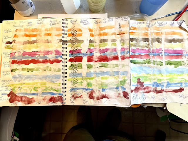
You must think all I do is paint, well, maybe 4 times a week for an hour or so...so not that much. It takes me longer to make these posts. Well, the budget just doesn't allow for too many new products, so I decided to test what I have in the house and in my paint stashes as resist products. Some items are over 20 years old...so bear with me and my results.

Charting your own products can be the only way to give a crafter/artist information on what a product actual does with the media/products they use.

On the left side I have my different types of media which are stroked from left to right across all three connected pages, it folds up neatly in my sketchbook.

Across the top are different resist or what I thought could be resist products.

Procedures after scribbling/striping each resist media down the pages. 

 I then painted by mixing the chosen media with enough water to carry the brush across one page and refilling and continuing, left to right.  I chose different colors and sometimes transparent and opaque hues of the same type of paint. Of course water weakens anything, but I needed a fluid one layer wash of as strong as possible color. 

oldnewgreenredo

Looks, like a mess, but let's look at it page by page and in detail.

Page 1
oldnewgreenredo

Across the top are the resist type products,
LtoR
Dawn Soap,
Yellow chalkboard chalk, 
Washable Elmers Clear Glue in twist top bottle
Modge Podge Matte. 

These were all brushed, scribbled or painted down the page in quick strokes.
After painting, the resist surfaces were wiped with a damp cloth...of course this also affects the water colors.

I've circled in pen any interesting or worthy effects.


The colored stripes from Top to bottom are the following media. 
(Gold) Cake Gouache,
(Orange) Tube Gouache, 
(Brown-almost opaque) VanDyke Brown tube watercolor, 
(Lime-Green transparent) tube Watercolor, 
(Quinacradone Crimson-Transparent) Golden tube fluid acrylic, 
(Blue opaque)-Golden tube acrylic, 
(Crimson transparent)-Golden tube acrylic, 
(Green)Artists Loft Acrylic tube paint, 
(Blue) Apple Barrel acrylic craft paint,(Lime transparent) Alcohol marker,(Green )Alcohol Ink dripped into sprayed alcohol solution, 
(Blue) Alcohol Marker, 
(Deep red )Alcohol ink dripped unto sprayed alcohol solution.

The alcohol products were not in contact with the water.

All the products were thinned so they would paint/mark all the way across the page.

BELOW on page 2, the  color stripes are all the same as above on each of the three pages.
I've circled in pen any interesting or worthy effects.

Page 2
oldnewgreenredo

Resist from Left to Right going down the page.

Left to right going down, 
Black Grease Pencil-nice and strong, 
Pebeo Drawing Gum solution, 
Gum Arabic, 
Titanium Zinc white oil stick, 
Scotch Permanent Glue stick, 
White acrylic gesso,

These were all wide stroke applied without any  scribbling except for the grease pencil.  Again everything was wiped off with a damp paper toweling.

Page 3
oldnewgreenredo

Left to Right to bottom, 
Lt. Blue wax Crayon,  
Washable Wax Crayon, 
Pebeo Masking Pen, wiggles and straight (peel off when dry), 
Aleenes Clear Tacky Glue,
Empty space was to be- Winsor Newton masking liquid-second bottle that has dried up on me...and it's 15+$ a bottle so no results, but I won't be buying it again. DANG!)
Elmer's washable Glue stick in last spot.

The Pebeo products actually worked the best, leaving white paper to show, but had to be peeled off after everything was dried. All the other products worked to some degree with certain types of paints. All columns were lightly wiped with a wet paper towel to wipe away on top of the other resists. the alcohol products did what they were supposed to do without washing off.

 Alcohol inks and markers really penetrate the paper and even the Pebeo products didn't completely protect those surfaces. You can definitely get some interesting textures and mottling though, so if you use these mediums experiment with your own products and by all means, chart them.

Water colors are mostly transparent and water based Gouache are opaque were also weakened or textured with almost all of the products except for chalk and white gesso.

 Gesso is actually a painting ground and simply absorbs the colors of everything, but washing off a bit will expose the textures the gesso strokes or application may show.Interesting textures can be had with stencil or textured gesso surfaces on paper.

The Acrylic products worked pretty well over all the resists, except for again Gesso which absorbed the colors.

Inexpensive Good results for water based paints were: 

Washable Kids Elmer glue stick...great mottling for large surfaces.

Dawn dish soap worked OK, but removing from small areas would be difficult and q-tips would need to be used. Mottling effects can be achieved with this.

Elmers Washable bottle glue with twist tip...works well for lines with even opaque products, smeared gives interesting effects.

Crayons show through pretty much anything, but don't actually resist much. Worth experimenting with.

Scotch Permanent Glue stick, a little bit stronger than the washables, and it won't wash away, so permanent.

Chalk---gave interesting effects with alcohol products, not much with water based.

$$ Pricier Good results for water based paints or alcohol products.

Grease Pencil...shows through everything, won't remove with repeated layers or rubbing off with water, but dissolves with alcohol products. (this is the pencil you peel paper off of to expose the grease stick).

Modge Podge is basically a sealer/but, alcohol soluble..so great for washing off water media surfaces. A thin or thick application or stenciling/stamping would effect water based media and give great effects. Totally ineffective with alcohol products as it will dissolve into mush with them.

Aleene's Clear Tacky Glue. (This is my go to glue for lots of projects) A bit pricier than Elmers, but works well under all water based paints except for opaque craft paint. Even plays well with alcohol products. Test first before using.

$$$ Most Expensive ( of course these have the best results)

$$ Pebeo products provided excellent results....on the higher $ amount but for precise resists, it's great. (note bought and used at the same time as Newtons but doesn't seem to dry up (1 year old product)

$$ Gum Arabic is used in oil painting and as a binder for water colors...so it does give some resistance to watercolors when wiped off with a wet cloth. Mottled textures, stands to reason it may react differently with different types of water colors.
It also affects alcohol, but probably not predictable, but a way of creating unexpected textures!. 

$$$Windsor Newton resist. I do not recommend, because I have two bottles that dried up in less than 2 uses each.

I hope you find this useful, and even better encourage you to try different types of resists with the painting/crafting products you use. 

   Happy RESIST Painting!  

All the opinions and photographs in this blog are my own unless identified, I have not been paid or reimbursed in anyway for my opinions, posts or any products shown.