Ad-Free Blog
Water color fun, finally a real painting, still an exercise, but a real painting with a subject matter!
Everyone was very excited to start this class because we were going to paint an actual Abstract landscape. Armed with the experimentation and previous technique classes, Ruth, our instructor, showed us a lovely photo of Mt. Ranier.
I prepared my palette with the tube water colors I thought I would use.
Grumbacher Hookers Green Deep
Grumbacher Hookers Green Light
Windsor Paynes Gray
Windsor Cobalt
Grumbacher Indigo
Grumbacher Red (an earthy red for mixing shadows)
Grumbacher Thalo Violet
In the end I added a bit of Pearl Solid WaterColor by YiWu a cheapy tiny set of paints from Temu. I used gold, steely silver, and a bit of greens and a touch of the lavender and blue.
Synthetic Brushes I used
3 rounds in graduated sizes( larger the area the larger the brush) I don't think I used the smallest one, but I had it set out---in case.
3/4" wide flat (for wetting large areas)
and thin 1/2" flat for edges and straight lines.
(I like synthetics because they are a bit stiffer and you can get some nice edges with them. They carry plenty of water and are easy to clean and shape after use. Natural bristles (even good ones) tend to shed, and I hate picking hair off my painted areas, it always leaves a mark.)
Class began with a discussion of our subject matter
Our Inspiration a photo of Mt. Ranier.
 |
| Pinterest |
This is a similar photo of Mt. Ranier than we used, with a different light location. I didn't get a copy of the original we used in class with all the still water and reflections...but you can see some of the same basic shapes.
Picking something for inspiration helps on the decision making. You can pick and choose which elements of the photo or print that you might want to emphasize. I highly recommend working from other sources...what you include is up to you ---The ARTIST.
I'm working on a Good quality Strathmore 140# water color paper. I choose the smoother side of the paper since I planned to work in flat shapes and blocks of color.
Ruth had us sketch the basic shapes of triangles, lines, blocks. We moved between the three projects to let them dry. The class working time is about 40 min....so you don't have time to PONDER and ANGST...YOU JUST PAINT.
I earnestly tried to keep them different with the prompts from Ruth.
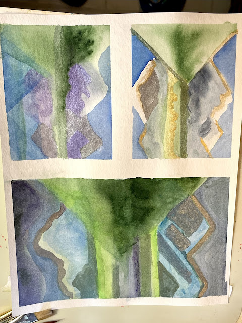
The large triangle on the left (GreenS) was wet on wet. We painted a large triangle in water and then striped a wet green loaded brush across. I blew on my painting to make the color spread instead of adding more paint. Carefully moving my brush around the shapes.The stripes and reflections were last with the greens. The snow is paper left bare. This isn't terribly abstract---you know it is mountains, trees, water ...and sky. But the details are eliminated and the basic shapes still tell the story.
We did the same on the blue sky and water. The mountains I used Payne's gray and Thalo Violet working on a wet surface and loaded color.
The accents of the pearl paints were added when dry. I emphasized the green triangle with edges...and I like how it becomes a stronger shape.
(Remember we were working on all three paintings at once)
This is the largest of the painting...which means more water and more paint.
On this one we did some flat applications of wet paint on dry paper. I stylized my shapes a bit more and had the reflections a bit wavy and more suggestive. Trying to mixing up what I was seeing in my head. Trying very hard not to do details(I so wanted to paint fir trees)...I kept the blocks of color pretty intense and defined.
I added more pigment to the green triangle after the first painting. same with the deep colors in the water. The blocks in the mountains were done in gray---and weren't terribly exciting, emphasized with the pearl paint...they took on an icy shimmer. I echoed the steely gray in the water in ripple waves.
This one is more moody and I really like some of the areas color variations.
The pearl paints were limited to the Mountains and the water (blue and steely gray)
NEXT!
This is the other small block. The zig-zag in the water was a mistake as I was trying to block out the reflections. I went with it and emphasized it, and well it adds a pattern to the painting that is interesting. Worked wet on wet as well as wet on dry with lots of layering/glazing of colors over colors. Only the Pearl steely gray paint on the the one mountain, and violet purple on the other.
This one was done the fastest...and even more simplified. I'm beginning to understand why artist's do a series of painting with the same subject matter---just to see all the avenues a project may go.
And a surprise---I Photo'd and Viewed from the end.....the paintings no longer become mountains and a lake...
but EXPLORATIONS OF PATTERN....
Tip it upside down.....
ISN'T THAT COOL?
My Mather classes for Seniors
are so much fun and they are free,
if you are over 55 and interested,
Thanks always for visiting.
I will try and respond to every comment and answer every question.
I'll be participating at these fun parties.
All the opinions and photographs in this blog are my own, I have not been paid or reimbursed in anyway for my opinions, posts or any products shown. Please do not use photos without linking back to this blog without my permission. Thank you for your cooperation, Sandi Magle